What Is Real Estate Branding?
Real estate branding gives a development a name, a look and a voice before the first buyer walks into the sales center. It covers the logo and the identity system, the colors and typography, the brochure and the sales deck, the signage on the fence, the listing banners and the social templates, and the guidelines that keep all of it consistent for the two or three years a project is on the market.
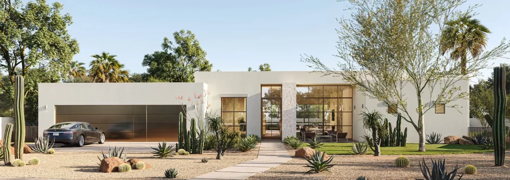
A project brand is a short-lived brand with a hard job. It has to make one development stand out among the others launching in the same city in the same season, hold together across print, screen and site, and still look right on the handover pack when the last unit closes. We build project brands for developers alongside the renderings of the same buildings, so the identity and the visuals are designed together and match from day one.
Who We Work With
Developers. A new condominium, a townhouse community or a master-planned neighborhood needs an identity that works at the pre-sale stage, when there is nothing to photograph and the brand carries the whole first impression. We build it from the architecture and the buyer profile, and we apply it to the exterior visualization and the interior renderings so the images already look like the brand.
Property marketing teams. In-house and outsourced marketing teams get a system they can run with: logo files in every format, a color and type system, templates for the deck, the listing pages and the social feeds, and written rules for using them. Fewer questions to the designer, faster campaigns.
Brokerages and sales teams. A brokerage launching a project under its own umbrella needs the project brand to sit beside the corporate one without a fight. We design the hierarchy, produce the sales collateral and hand over the files the team will actually use at the desk.
Four Jobs the Identity Has to Do
Be remembered from one exposure. A buyer sees the name on a fence banner, a portal listing and an Instagram ad in the same week. If those three do not look like one thing, the money spent on each is spent three times. A distinct mark, a color that belongs to the project and a consistent tone make the three exposures add up.
Hold from the teaser to the handover. The identity is used on the coming-soon banner, the investor deck, the sales center walls, the brochure, the contract folder and the welcome pack for new residents. It is designed for all of those at once, with the print and screen versions, the small and large sizes and the dark and light backgrounds resolved in the guidelines.
Match the visuals. Most project brands are made by one supplier and the renderings by another, and the two meet for the first time in the brochure. Ours are designed together: the palette is chosen with the renderings on the screen, the signage and the wayfinding appear in the images, and the brochure layout is built around the frames that exist. The architectural rendering set and the brand arrive as one package.
Make the sales team faster. A brand that lives in a guidelines document and a folder of ready templates saves a marketing team from redesigning every asset from scratch. The deck for the next investor meeting is a content change, and the listing banner for a new phase is a color swap.
What We Deliver
Naming and positioning
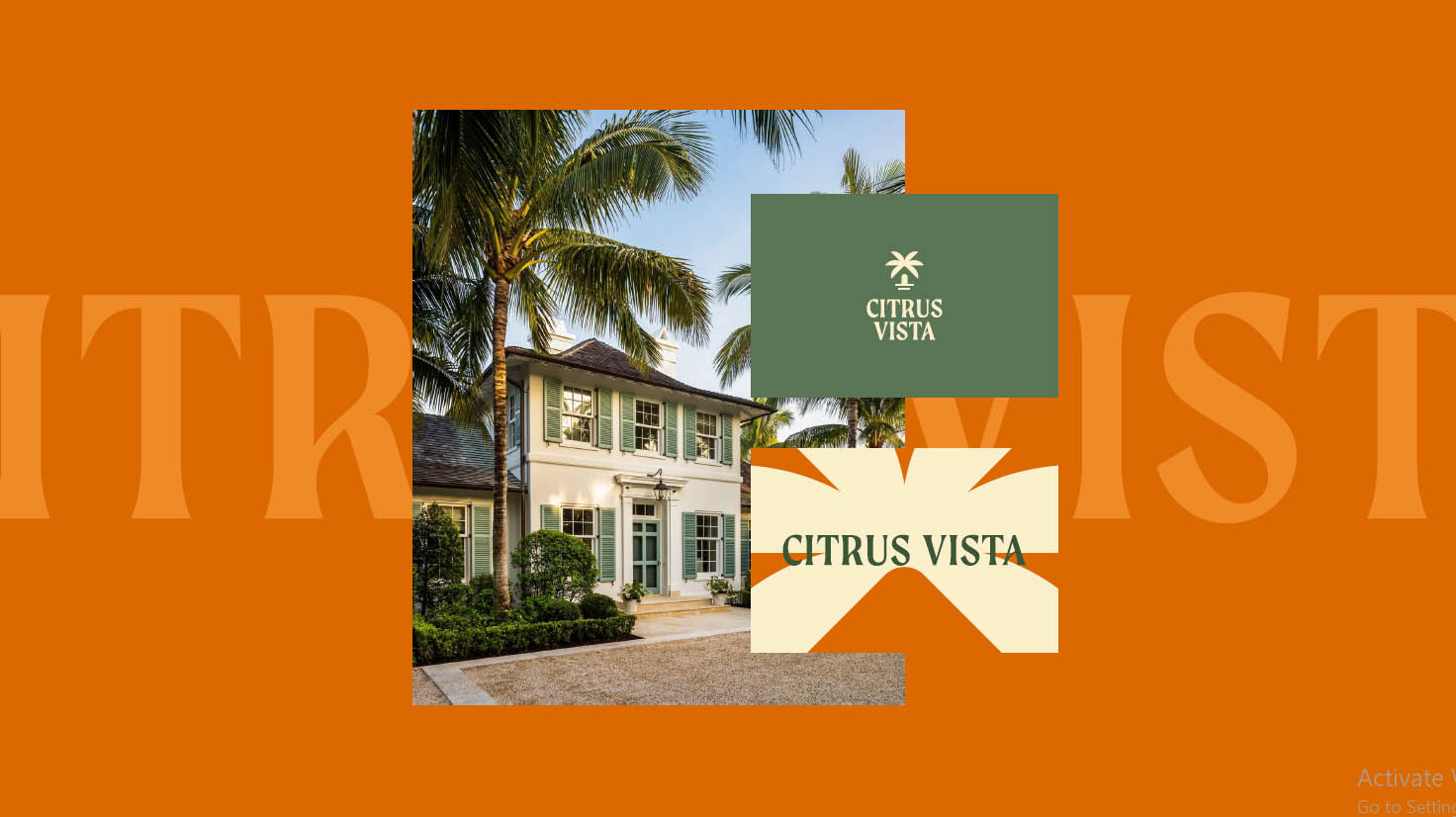
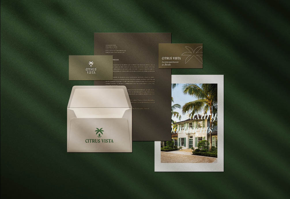
When the project has no name yet, we propose names checked against the local market and domain availability, with a positioning line that says who the development is for and why it is different from the two others launching nearby. Baymont in Miami Beach and Citrus Vista near Orlando both started this way, with no name on the drawings.
Logo and identity system
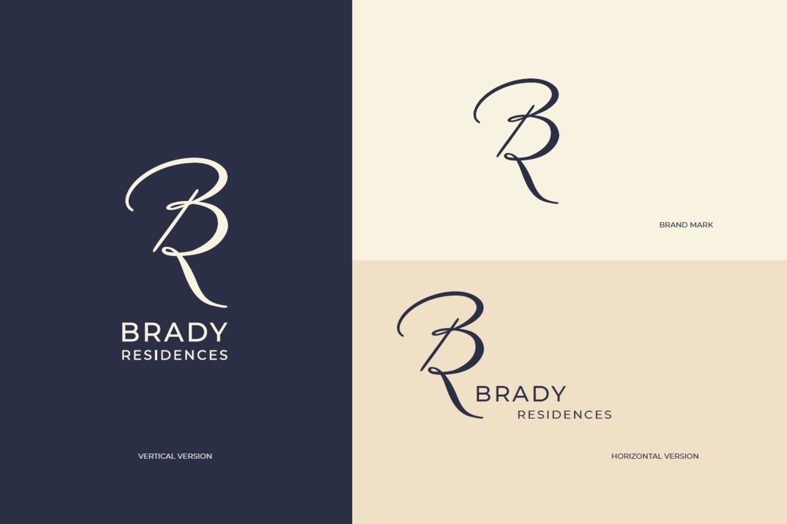
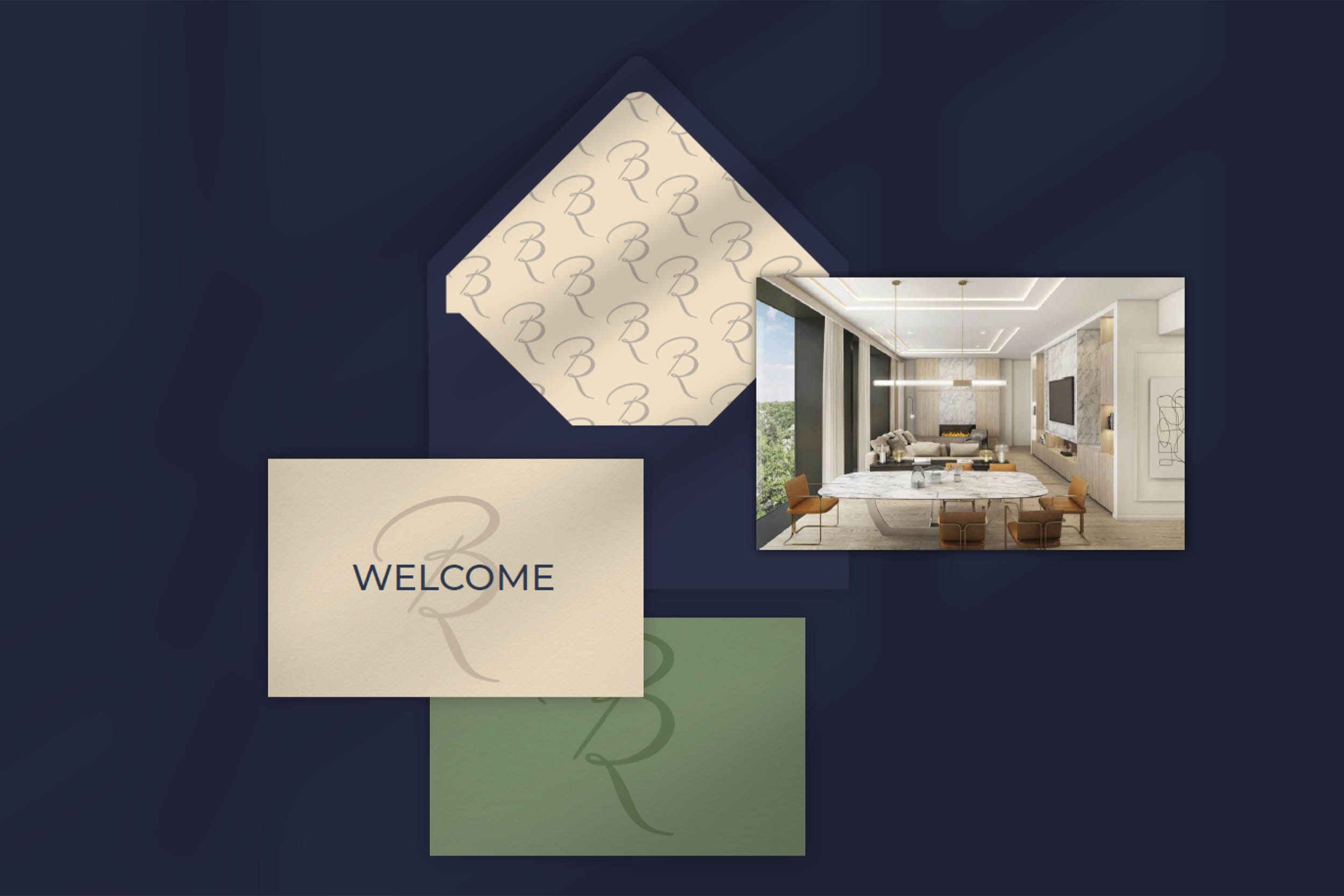
The mark, the wordmark and the lockups; the color system with print and screen values; typography for headlines, body and numbers; the pattern or graphic device that carries the brand where the logo cannot go, from envelope linings to the site banner.
Brand guidelines
A concise document with the rules: clear space, minimum sizes, color use, type hierarchy, photography and rendering treatment, and examples of correct and incorrect use. Written so a print shop or a portal designer can follow it without calling us. The guidelines for The Rowen in Dallas — colour, type, pattern, signage, digital and social — are a recent example.
Sales brochure and presentation
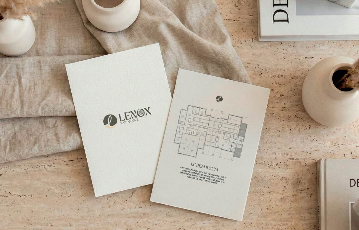
The printed brochure and the sales deck, built around the renderings and the floor plans of the project: unit pages, amenity spreads, location and specification, in the layout that the sales desk will actually flip through with a buyer.
Print, signage and merchandise
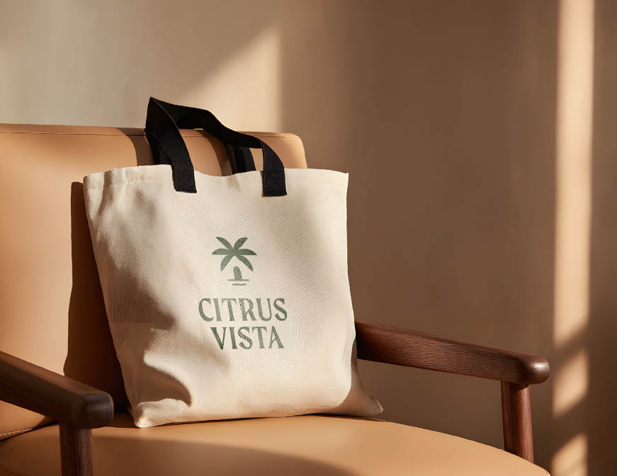
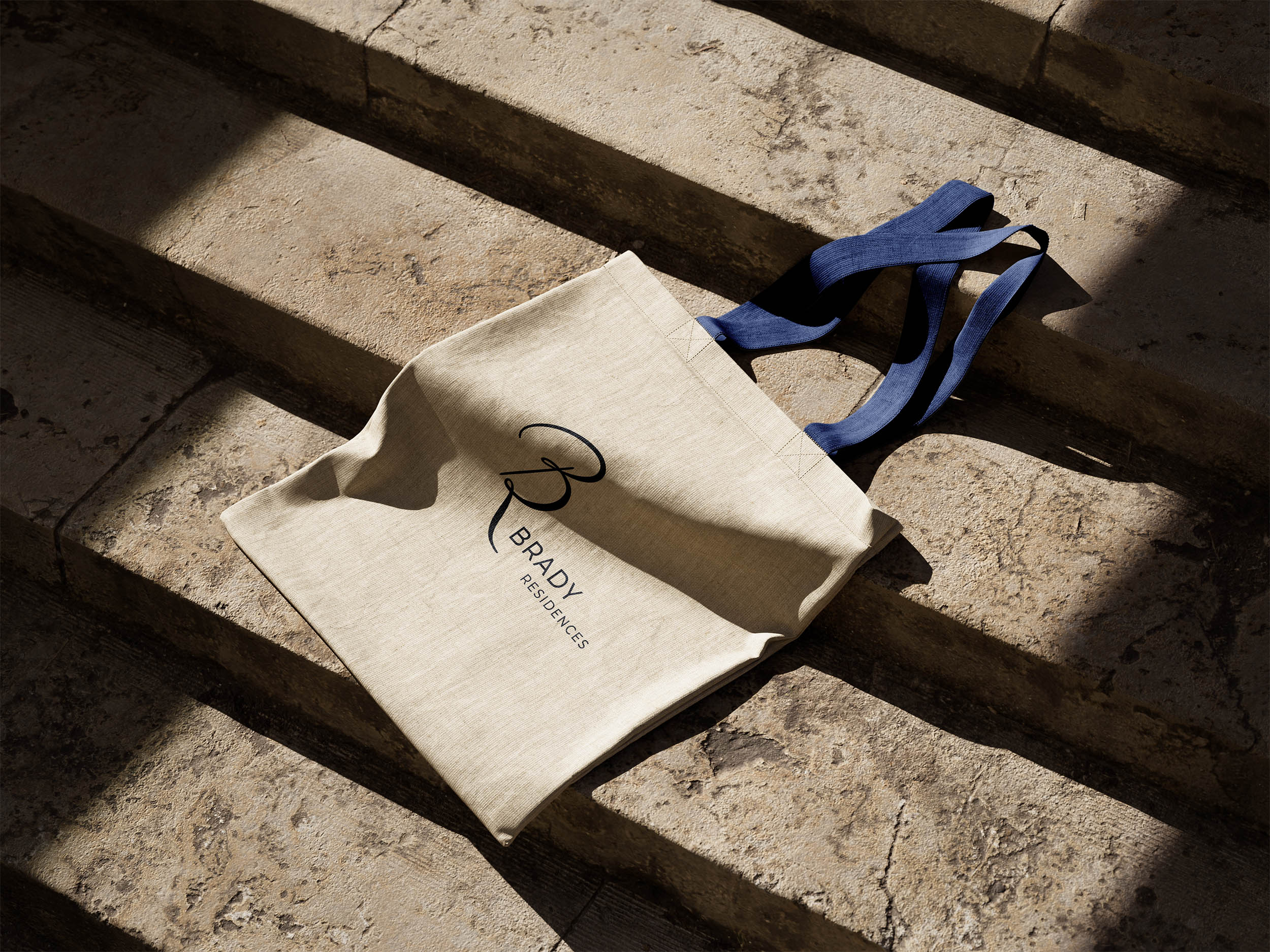
Business cards, letterhead, folders and welcome cards; site banners, wayfinding and sales center graphics; the tote bags and keepsakes that leave the sales center with a buyer and end up in a photo. For The Ambassador in Dallas that set ran from foil-stamped stationery to dimensional signage and the first launch campaign.
Digital assets
Website hero and section graphics, listing portal banners, social media templates, email headers and ad sets in the sizes each platform wants, all from the same system.
How a Branding Project Runs: Five Steps
1. Brief and positioning. We start with the architecture, the location, the unit mix and the buyer profile, and with the two or three developments the project will be compared to. The outcome is a one-page positioning: who the brand speaks to and what it promises.
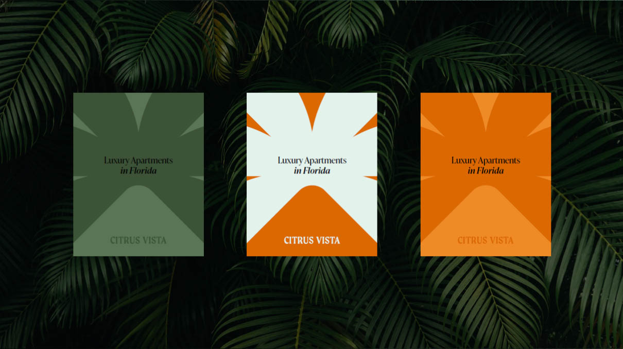
2. Direction. Two or three visual directions, each shown on the things the brand will actually live on: the fence banner, the brochure cover, a listing tile, a rendering with signage in it. You pick one, and we refine it.
3. Identity. The chosen direction becomes the full system: logo and lockups, colors with print and screen values, typography, graphic device, photography and rendering treatment. The renderings of the project are produced or adjusted in parallel so the brand and the images are consistent.
4. Assets. The brochure, the deck, the stationery, the signage and the digital templates are designed and prepared for production, with print-ready and web-ready files for each.
5. Guidelines and handover. The guidelines document, the complete file library and a short walkthrough for the marketing and sales team. Each stage includes two rounds of corrections.
Real Estate Branding Cost
Branding is priced per project: a logo and a brochure for a twelve-unit infill building and a full identity with naming, signage and a launch campaign for a five-hundred-unit community are different amounts of work. Tell us the scope and you will have a fixed price for it.
What sets the price:
- Naming. Whether the project needs a name, or has one.
- Scope of the identity. Logo and colors only, or the full system with graphic device, patterns and rendering treatment.
- Number of deliverables. Brochure, deck, stationery, signage, merchandise, digital templates.
- Markets and languages. A brand that has to work in two languages or for an overseas buyer pool takes more adaptation.
- Renderings in the package. Ordering the identity together with the exteriors and interiors of the project saves the coordination between two suppliers, and we price the package accordingly.
Send the drawings, the location and a note on who the buyers are; the price and the timeline come back the next business day, within 24 hours.
What You Get From Us
- Brand and visuals from one team. The identity and the renderings are designed side by side, so the palette, the signage and the photography treatment agree before anything is printed.
- Developer work since 2010. We have worked for real estate developers and their marketing teams since 2010 as a real estate development marketing agency, and the branding grew out of what launch packages kept needing.
- Built for the sales cycle. Guidelines and templates a marketing team can run without a designer on call for every banner.
- Confidential until launch. Names and identities for unreleased projects stay under NDA until you announce them.