Miami, FL
Baymont
Overview
A 25-storey oceanfront tower in Miami Beach that came to us before it had a name — and went to market three months later with a brand, a face and a film.
The developer was heading into pre-construction sales with architecture and a site, and nothing a buyer could see, say or hold. In one engagement we built that whole layer: the name, the identity and the printed sales kit, photoreal renderings of the building and its residences, and a promo film for the sales gallery and the launch campaign.
- Location
- Miami Beach, FL
- Building
- 25-storey oceanfront residences
- Timeline
- 2026 · three months
- Scope
- Naming, identity, print, 3D, film
The brief
Sell the building before the first floor is poured
Pre-construction sales live or die on the first impression. There was no name to put on a sign, no logo for a brochure cover, no image to show a buyer who was being asked to commit to a home that did not exist yet. The brief was to close that gap end to end — so the sales team could open the gallery with a complete kit, not a placeholder — and to do it in three months.
Naming
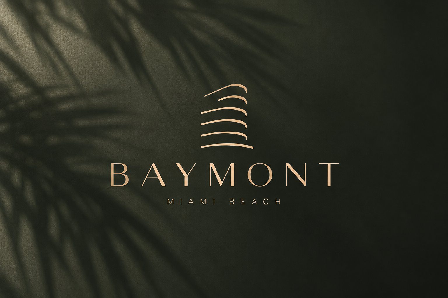
Baymont
Two words in one. Bay is the water the tower faces — Biscayne Bay, the view every residence is built around. Mont is height: twenty-five storeys rising over the low white blocks of the beachfront. Together they sound like a place that has always been there — in the family of Belmont and Claremont — rather than a marketing line. The name reads the same in English and Spanish, which in Miami is not a detail, and it was clear of any other project in the city.
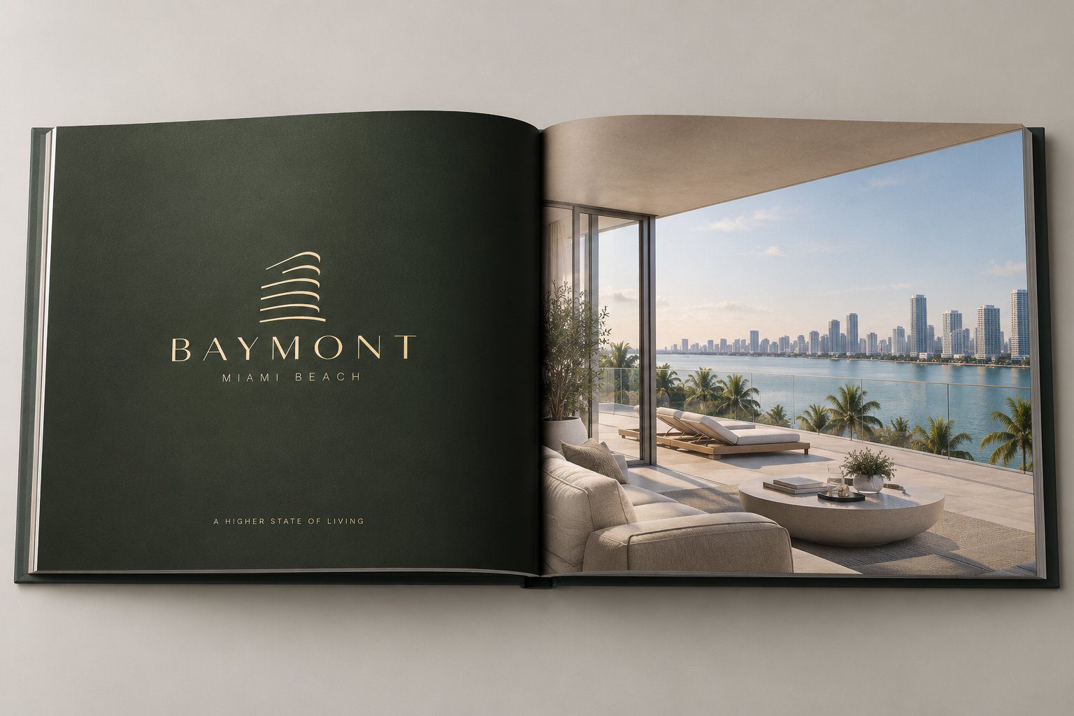
The tagline we wrote for it, A higher state of living, carries the same idea one step further: height as a way of life, not just a floor number.
Identity
A mark drawn from the building itself
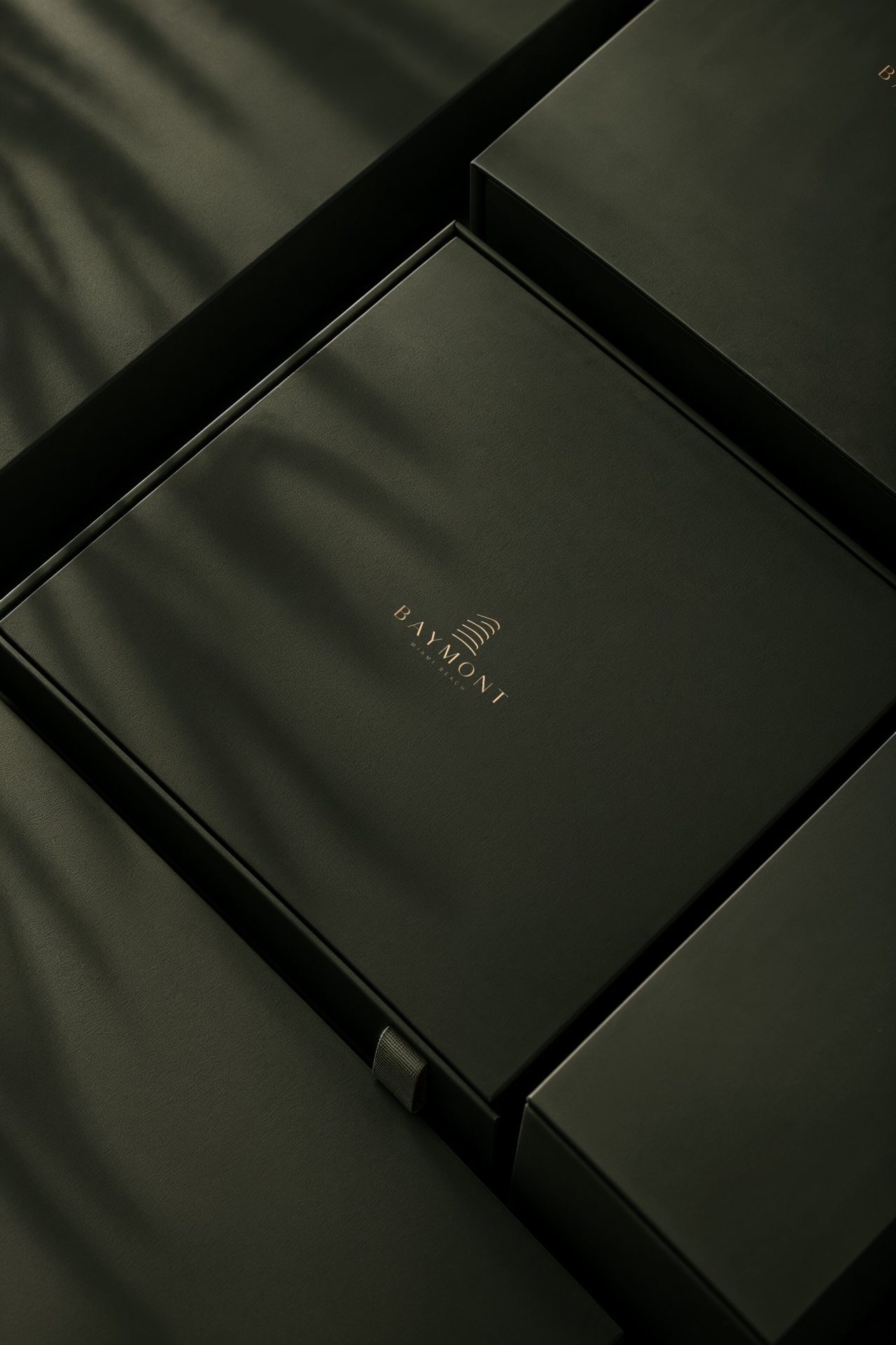
The symbol is the tower reduced to its floors: a stack of curved lines that step back as they rise, the way the balconies do on the real façade. Beneath it sits a wordmark in wide-spaced capitals. Both typefaces — the display letters of the mark and the text face that carries everything else — were drawn by our team for this project rather than licensed, so the identity belongs to Baymont alone.
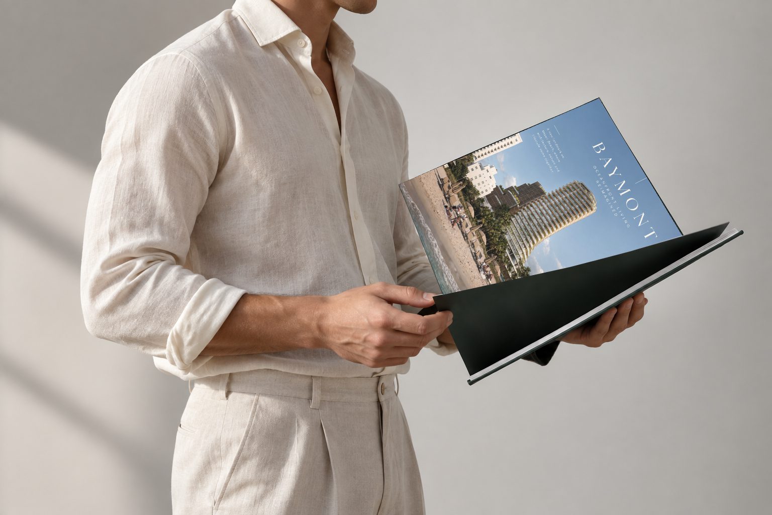
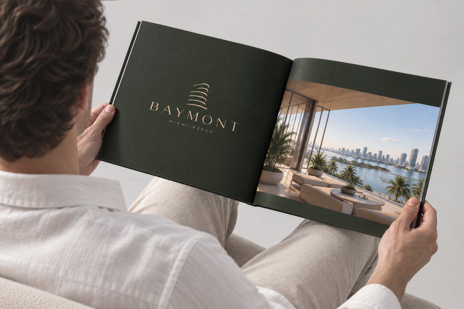
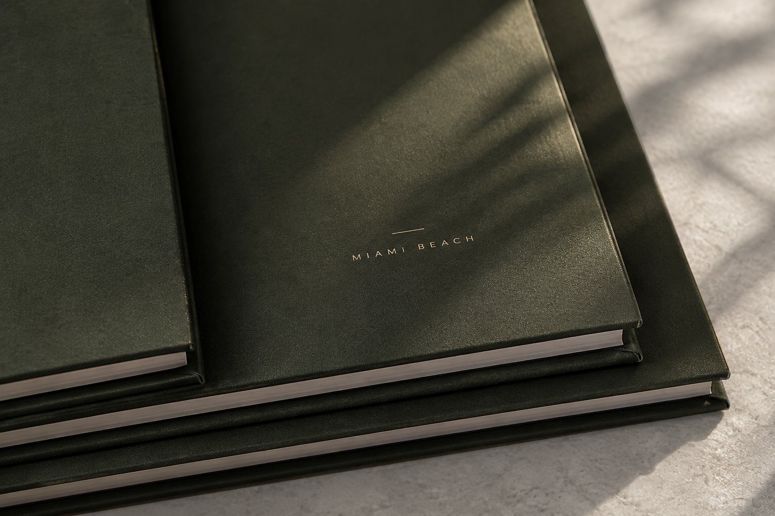
The palette is deep green and gold: the green of the landscaped terraces, the gold of foil on paper. That pairing was chosen for print first. The sales brochure, the presentation box a buyer takes home and the stationery were designed and produced as part of the same work, and the identity was tested on those surfaces before it went anywhere else.
Exterior
The tower on the beach
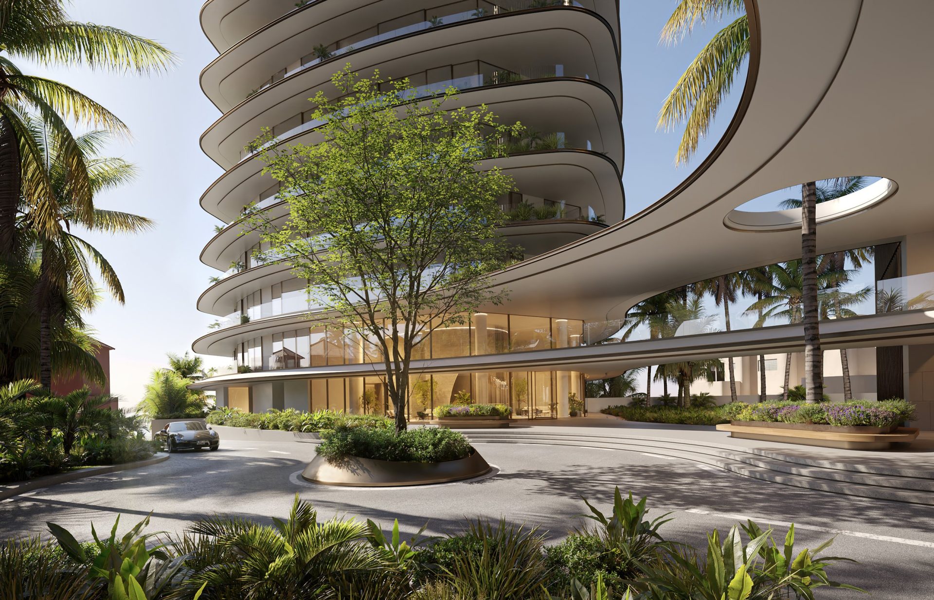
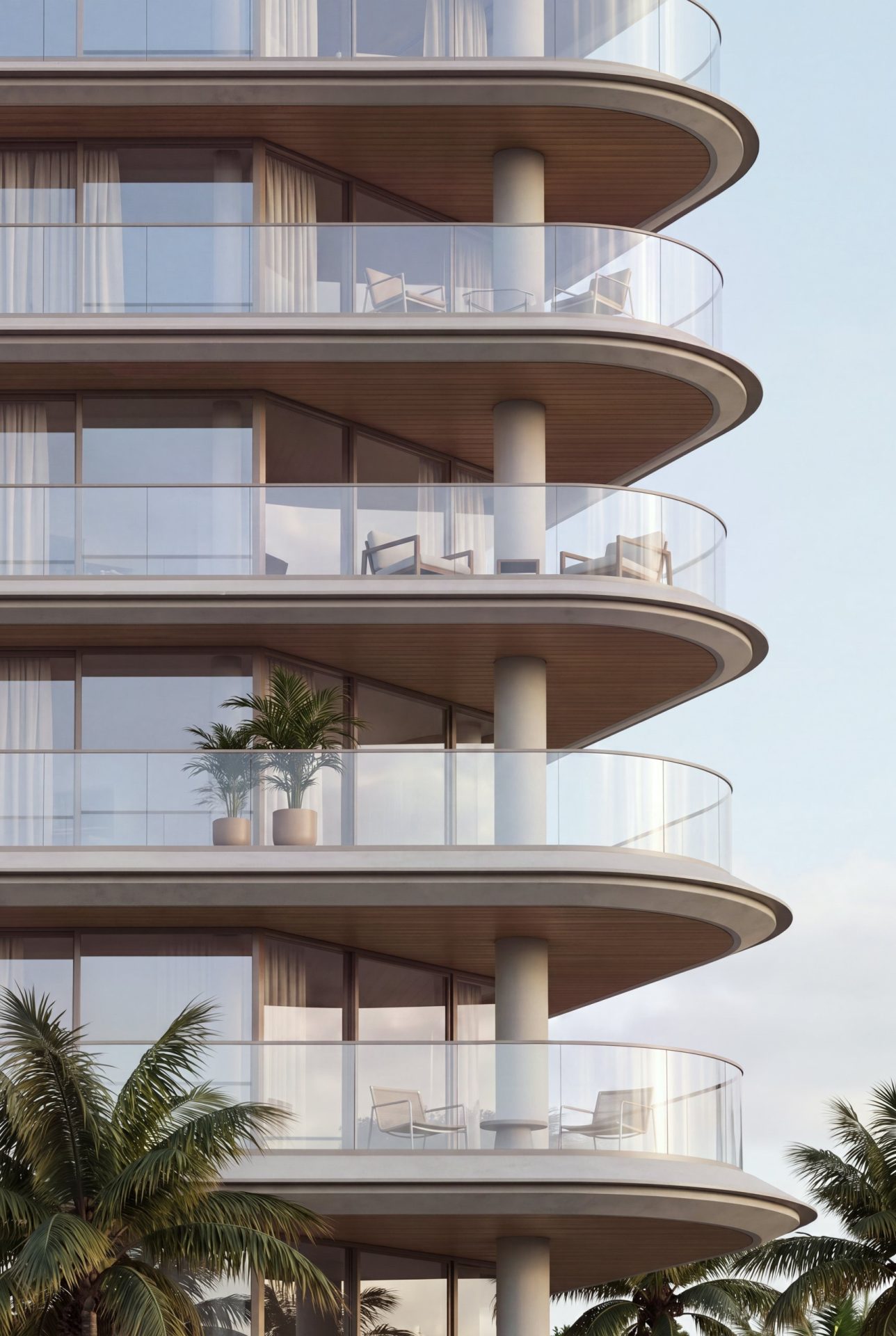
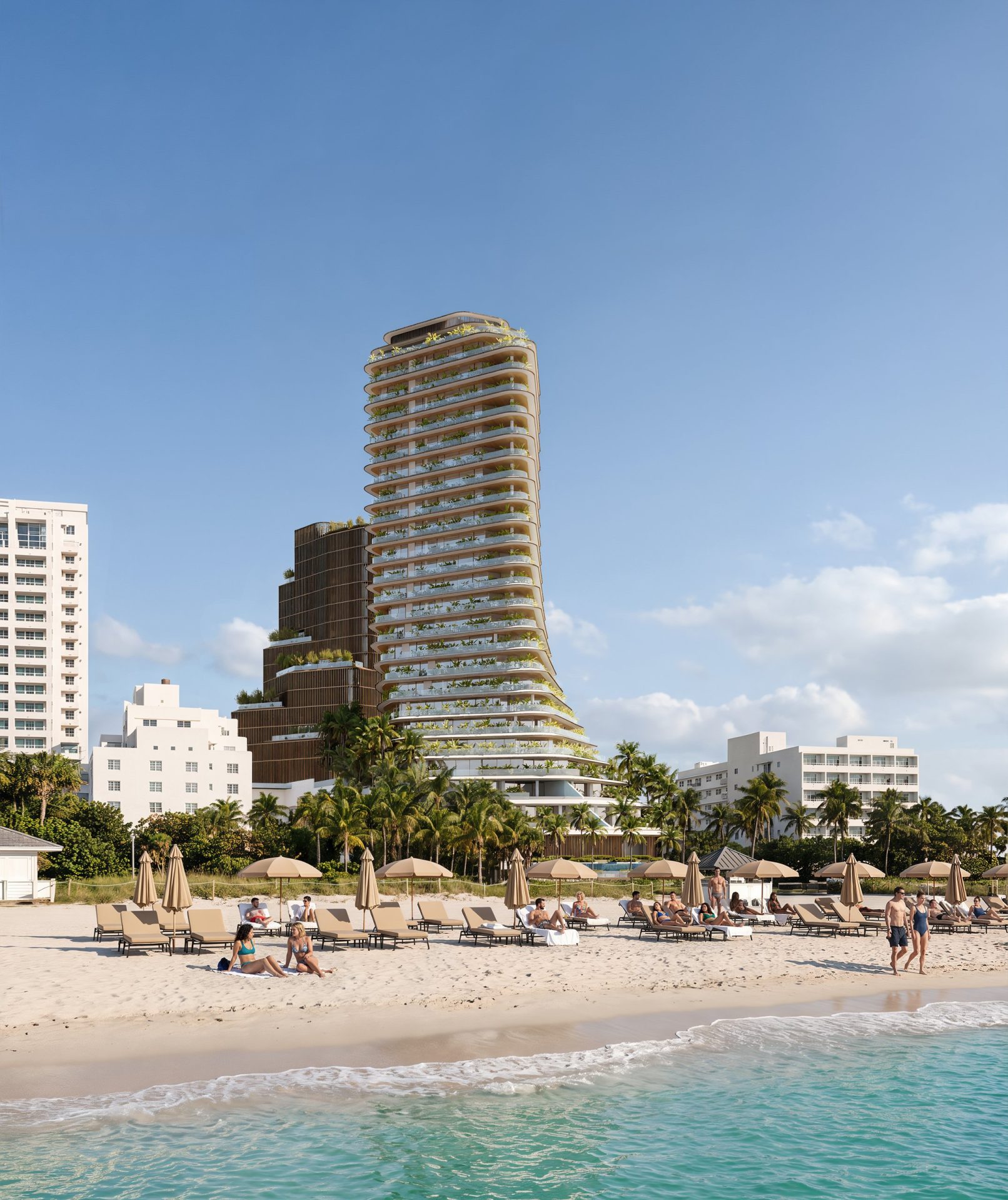
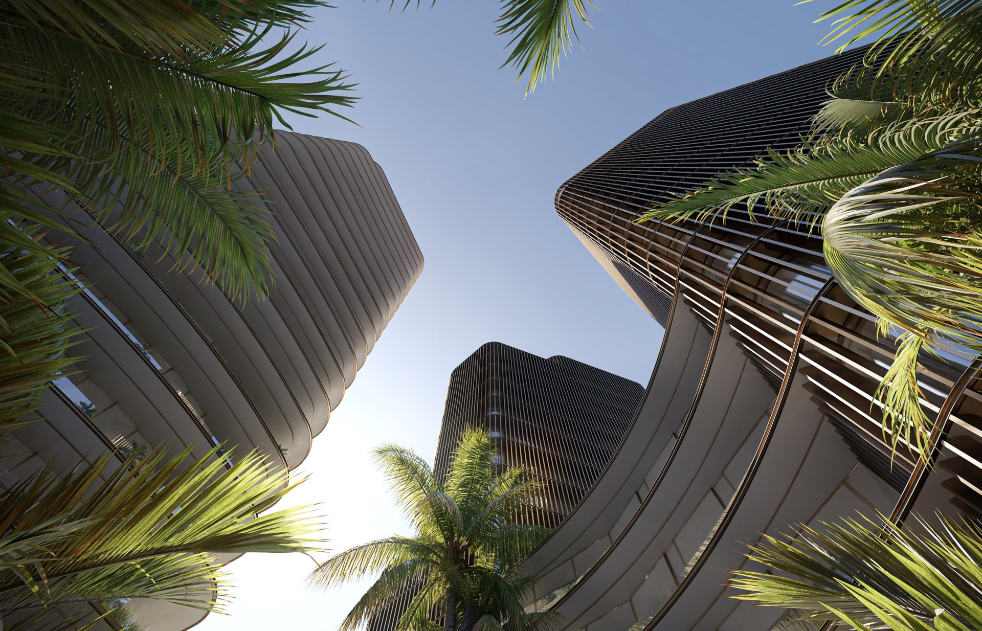
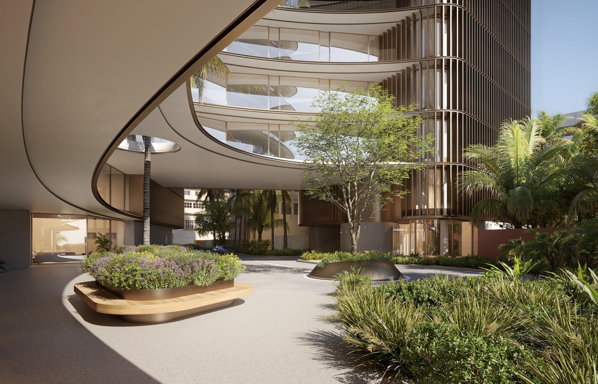
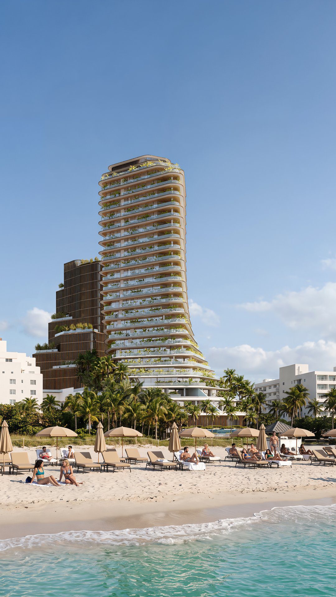
The exterior renderings set the building into its real context — the beachfront, the neighbouring Art Deco low-rises, the light of a Miami afternoon — from the street, from the sand and from the air. Each view was built to hold up at billboard size and on a phone screen alike.
Interiors
Residences you can already walk through
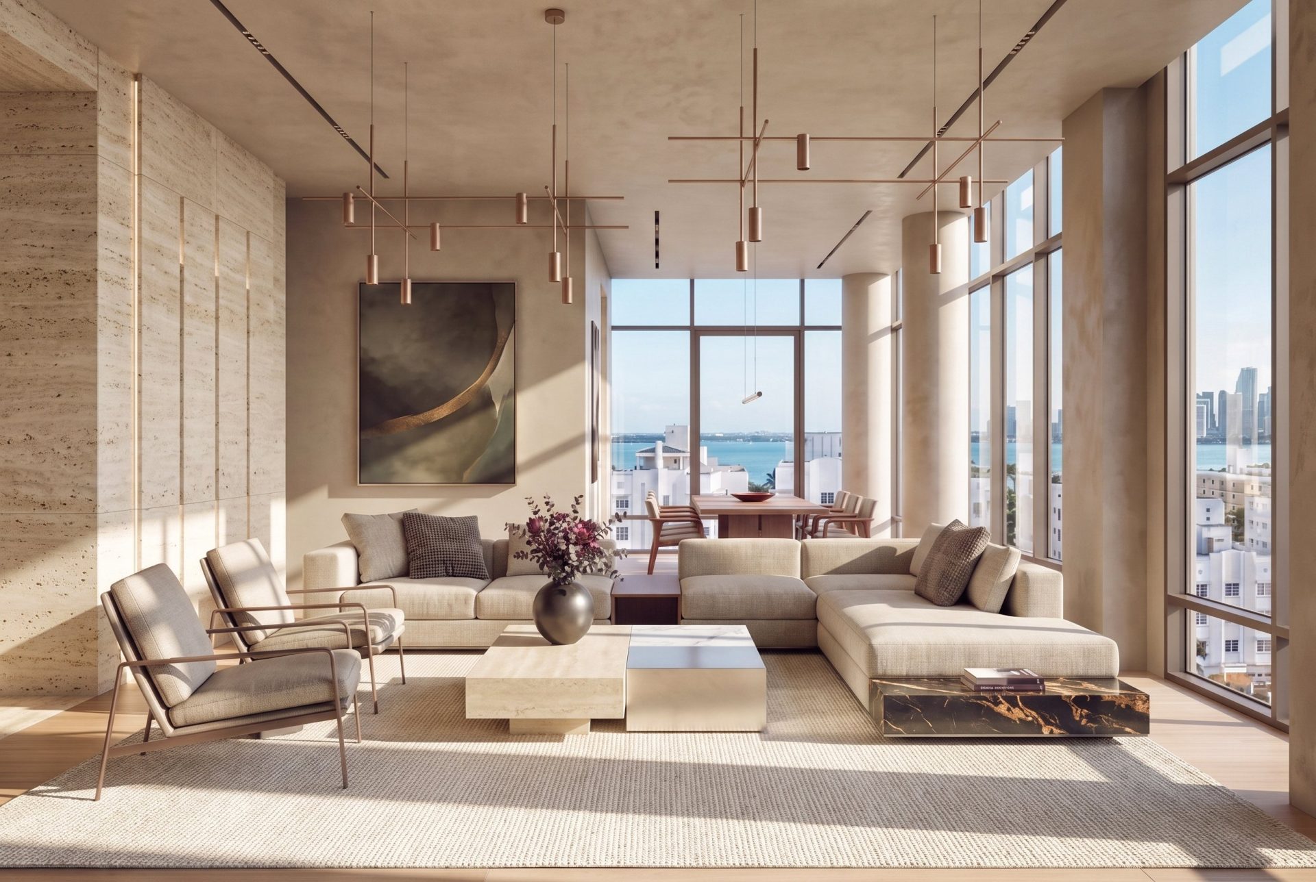
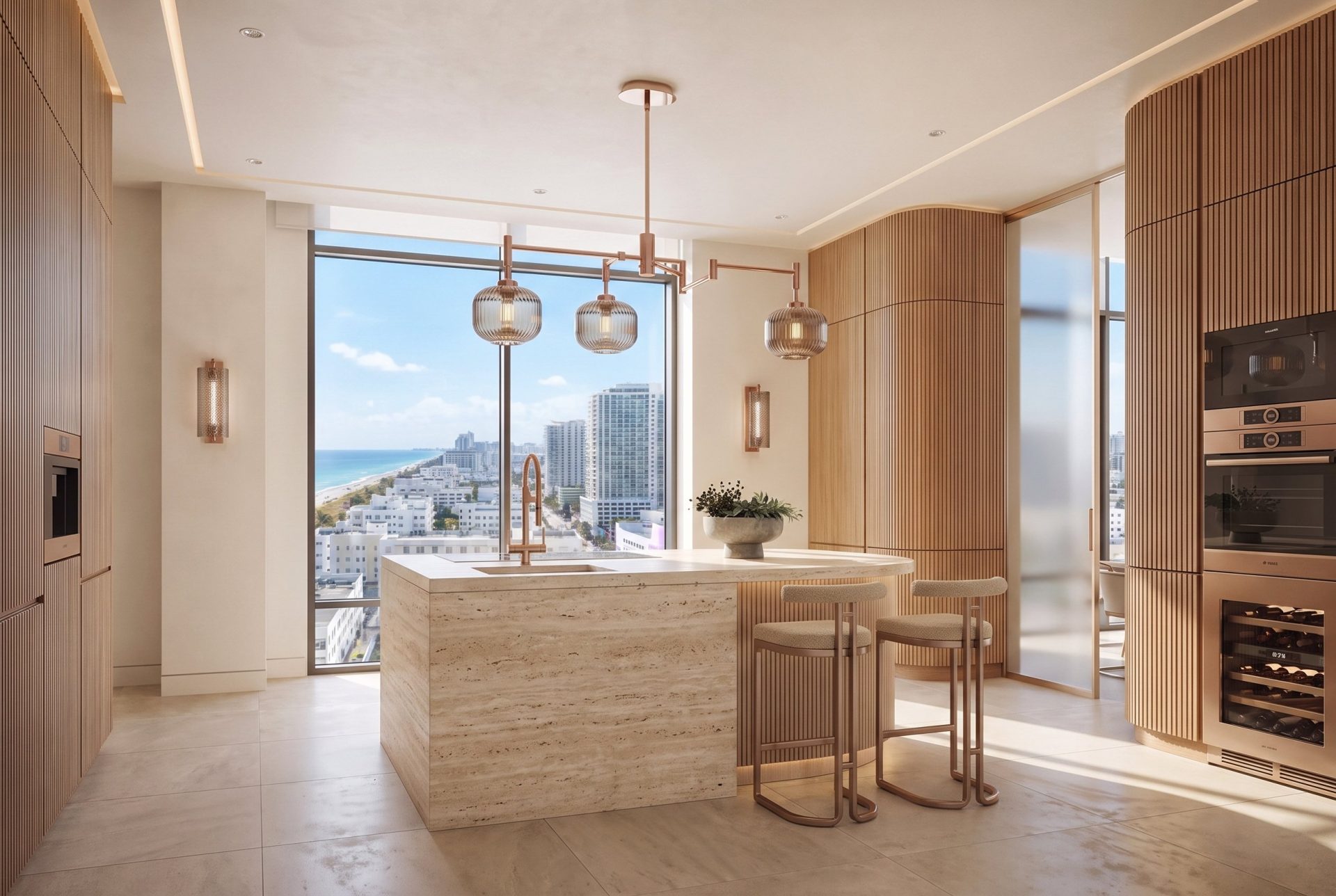
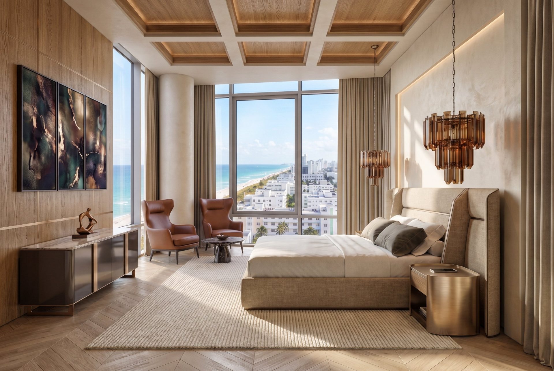
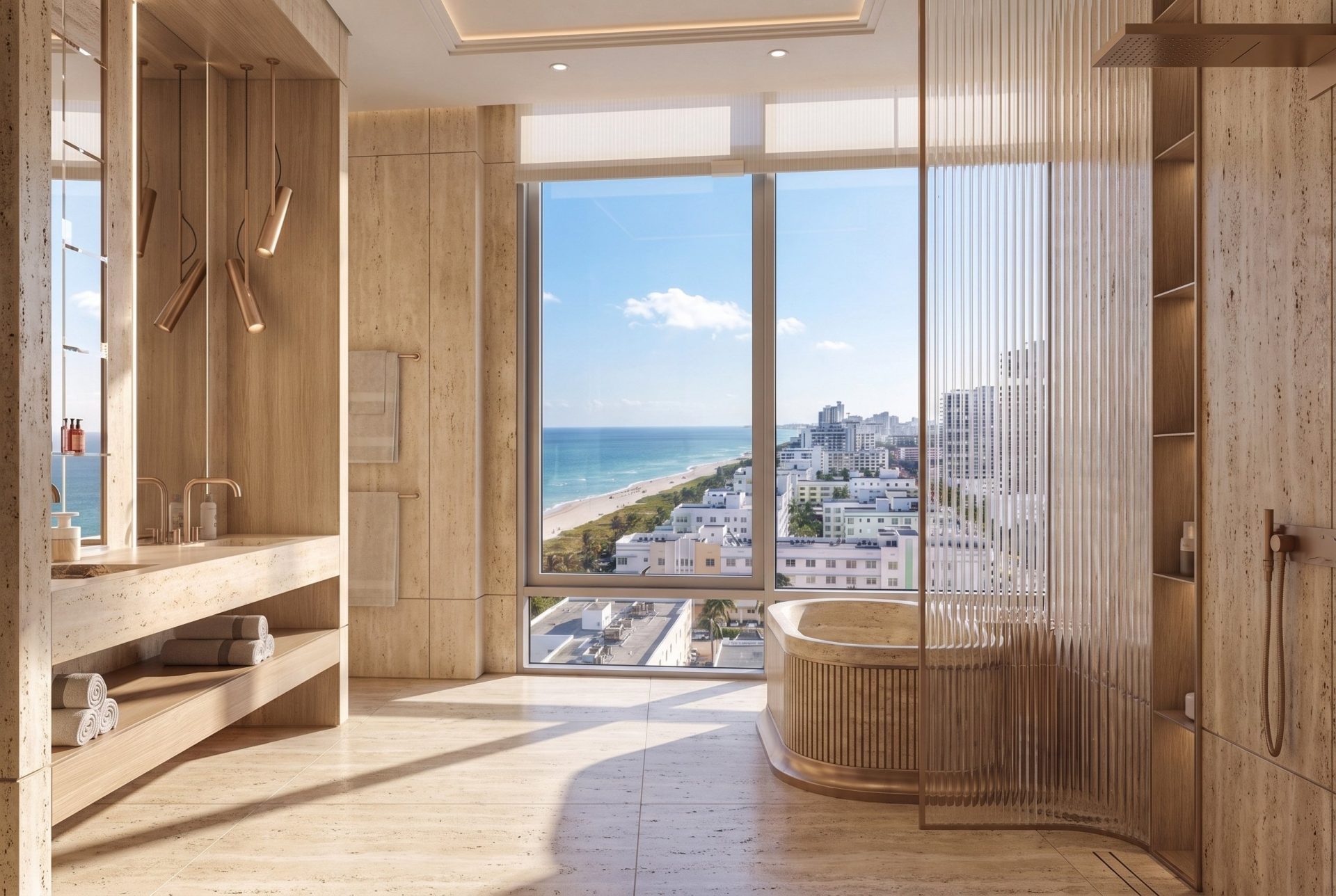
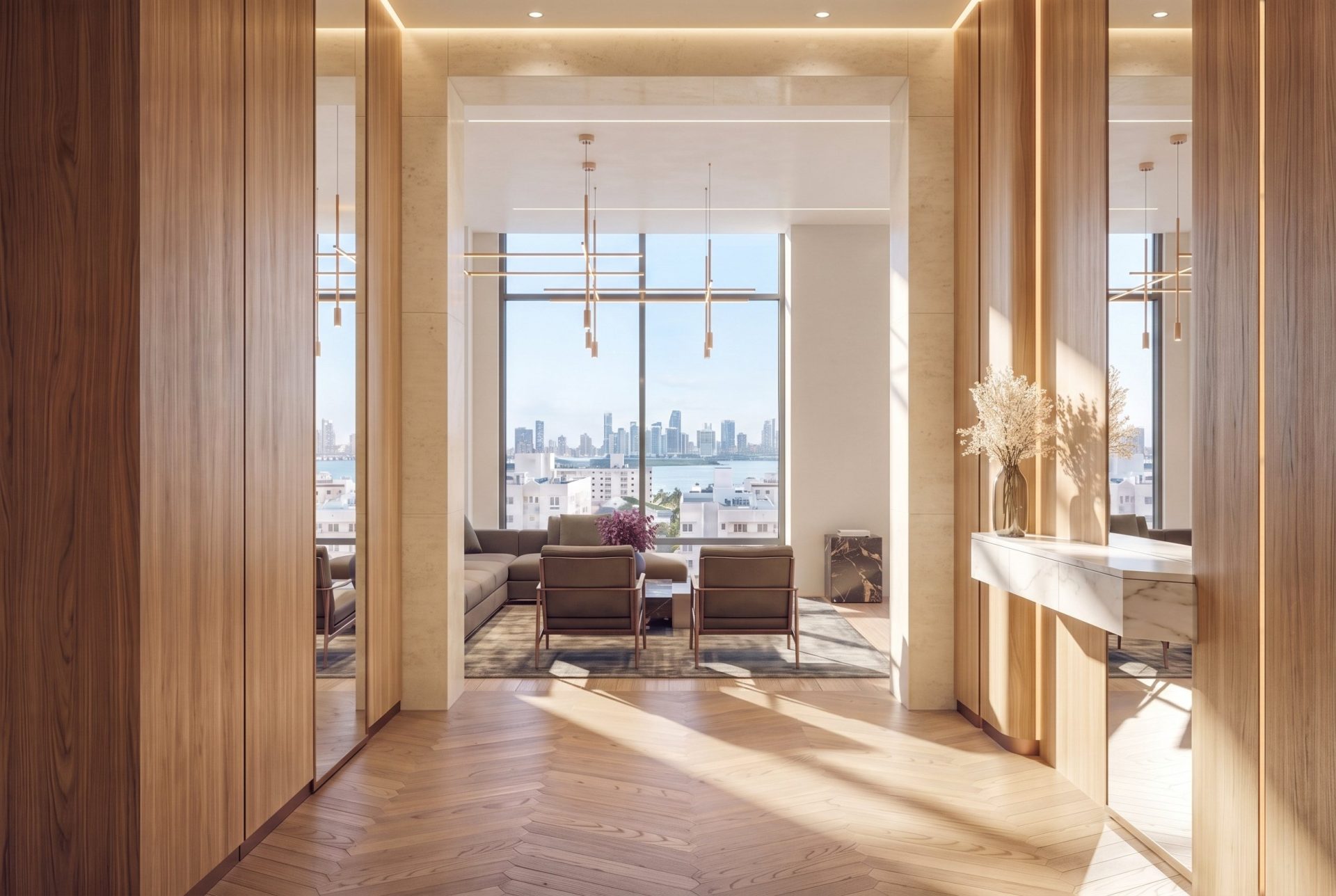
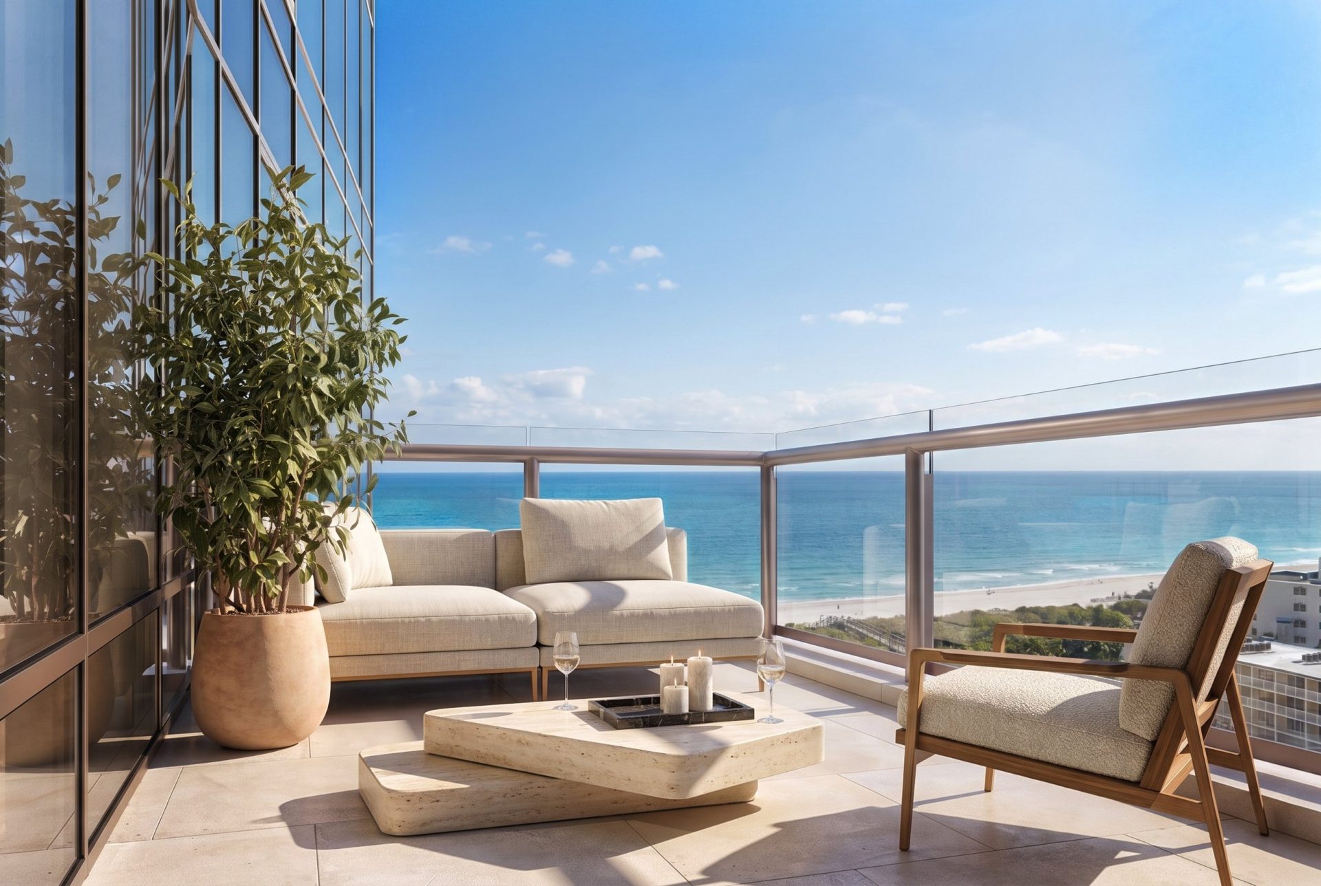
Foyer, living room, kitchen, bedroom, bathroom and the terrace over the bay: the interior renderings follow the developer’s finish schedule, so what a buyer sees in the brochure is what gets built. The same set covers the amenity spaces of the building, which stay with the sales team for now.
Film
The promo reel
The film was cut vertical from the start: a reel for Instagram and TikTok first, the sales gallery screen second. Same 3D scenes as the stills — the building, the residences and the view — built to stop a thumb, not to sit on a homepage.
Delivered
What the launch opened with
Naming and tagline. Logo, custom typefaces and colour system. Sales brochure, presentation box and stationery. Exterior and interior renderings of the residences and amenity spaces. A promo reel. All of it in three months, from a blank page to a sales gallery ready to open.
Services on this project: real estate branding — naming, identity and print; 3D exterior rendering; 3D interior rendering; 3D animation for the promo reel.