
Dallas, TX
The Ambassador
Overview
A new luxury residence in Dallas that carries the name of one of the city’s most storied hotels — and needed a brand that could live up to it.
ZRS Management was bringing The Ambassador Residences, designed by Corgan, to market. The name came with a legacy; everything else was to be built: the symbol and the wordmark, the design system and its guidelines, the printed collateral, the launch campaign and the renderings of the spaces the brand would hang in. Two months from brief to a complete kit.
- Location
- Dallas, TX
- Client
- ZRS Management
- Timeline
- 2026 · two months
- Scope
- Identity, collateral, campaign, 3D
The brief
A hotel, not an apartment complex
This brief ran to several pages, and its first line set the bar: this should not read like an apartment logo. It should feel like the mark of a luxury hotel, a private club or a landmark building. Art deco, but reinterpreted rather than replayed — no Gatsby costume, no theatrical ornament. A typographic logo first, with a custom “A” and a monogram. Black and antique gold, warm ivory, deep burgundy. And a list of everything the identity would have to survive: dimensional signage, foil stamping, leasing folders, floor plans, menus, welcome materials.
Heritage
Living up to a name
The original Ambassador was one of Dallas’s most storied hotels, and the new building keeps its name — which is a gift and a test. A gift, because the name already means arrival, history and a certain old-world prestige. A test, because a brand that borrows it and then looks like every other leasing office betrays it at once. Our rule for the whole project: the identity had to feel as if it belonged inside Corgan’s building — the warm woods, the brass, the black metal and marble — not placed on top of it.
Symbol
A key and a letter, sealed in an oval
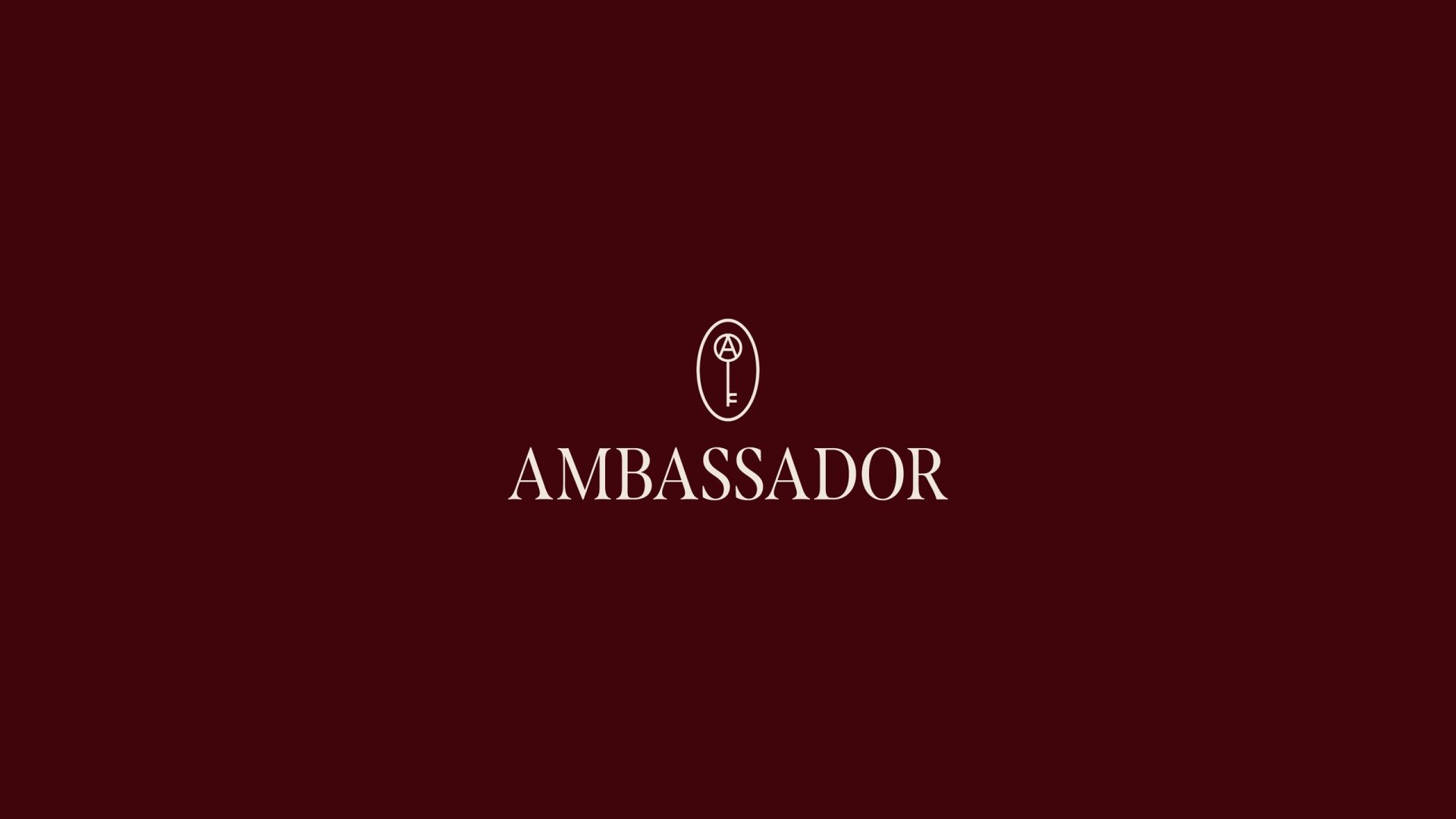
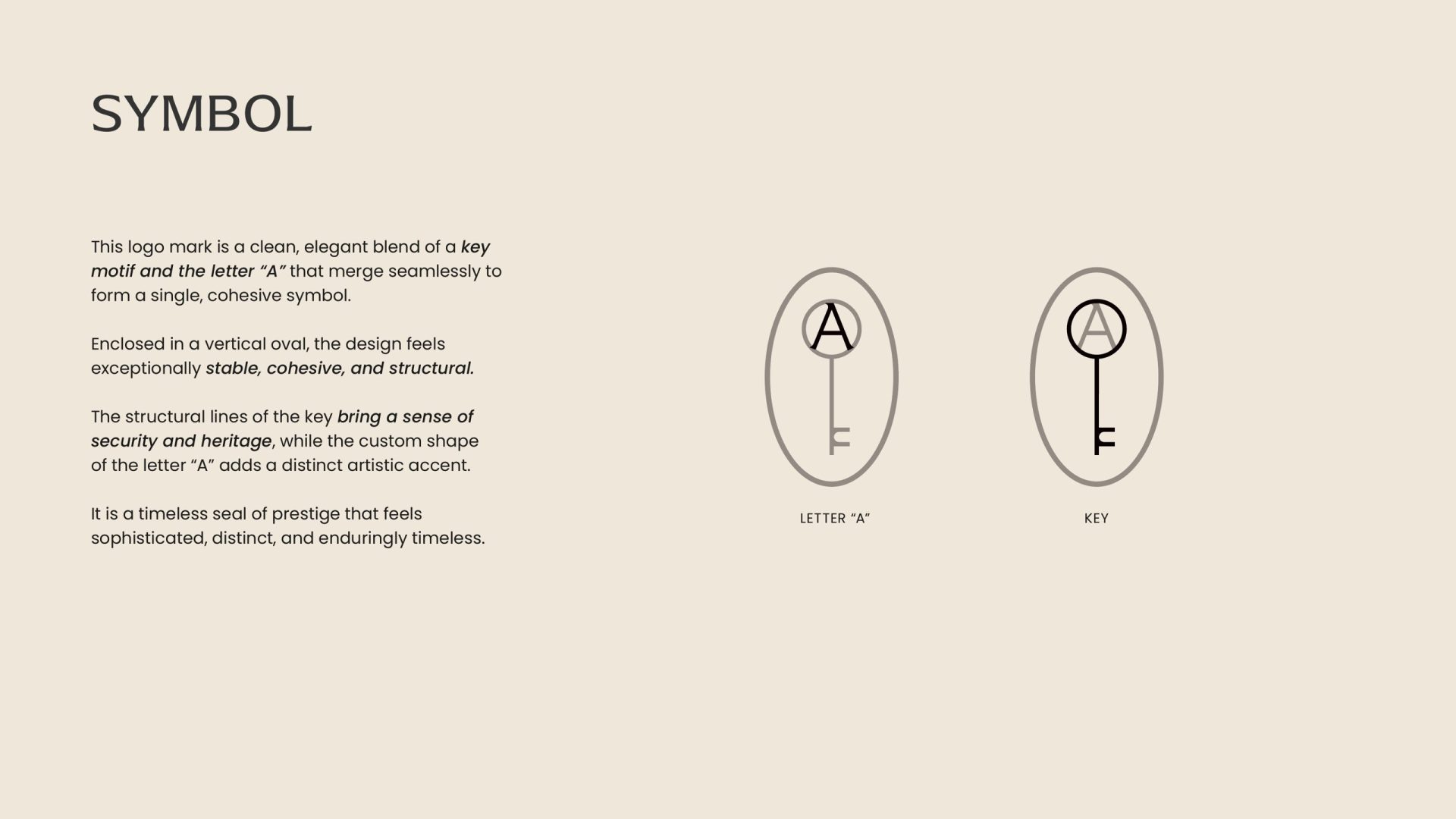
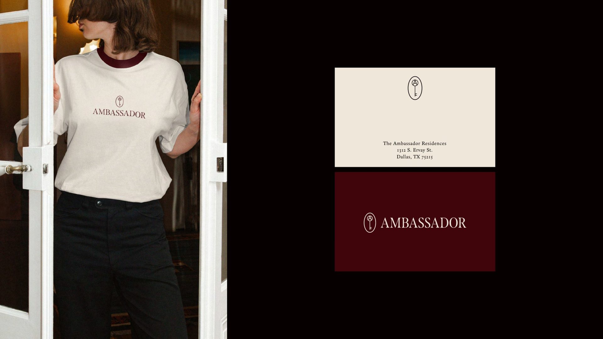
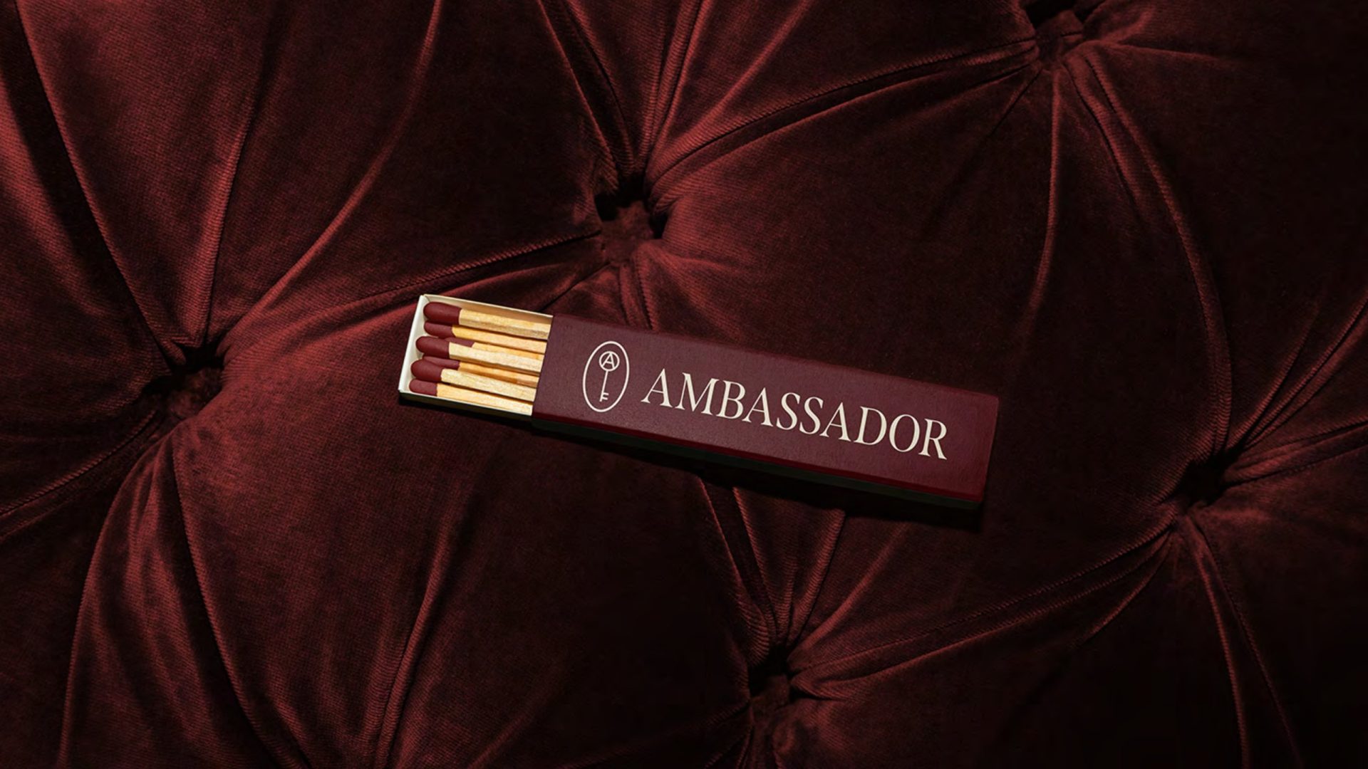
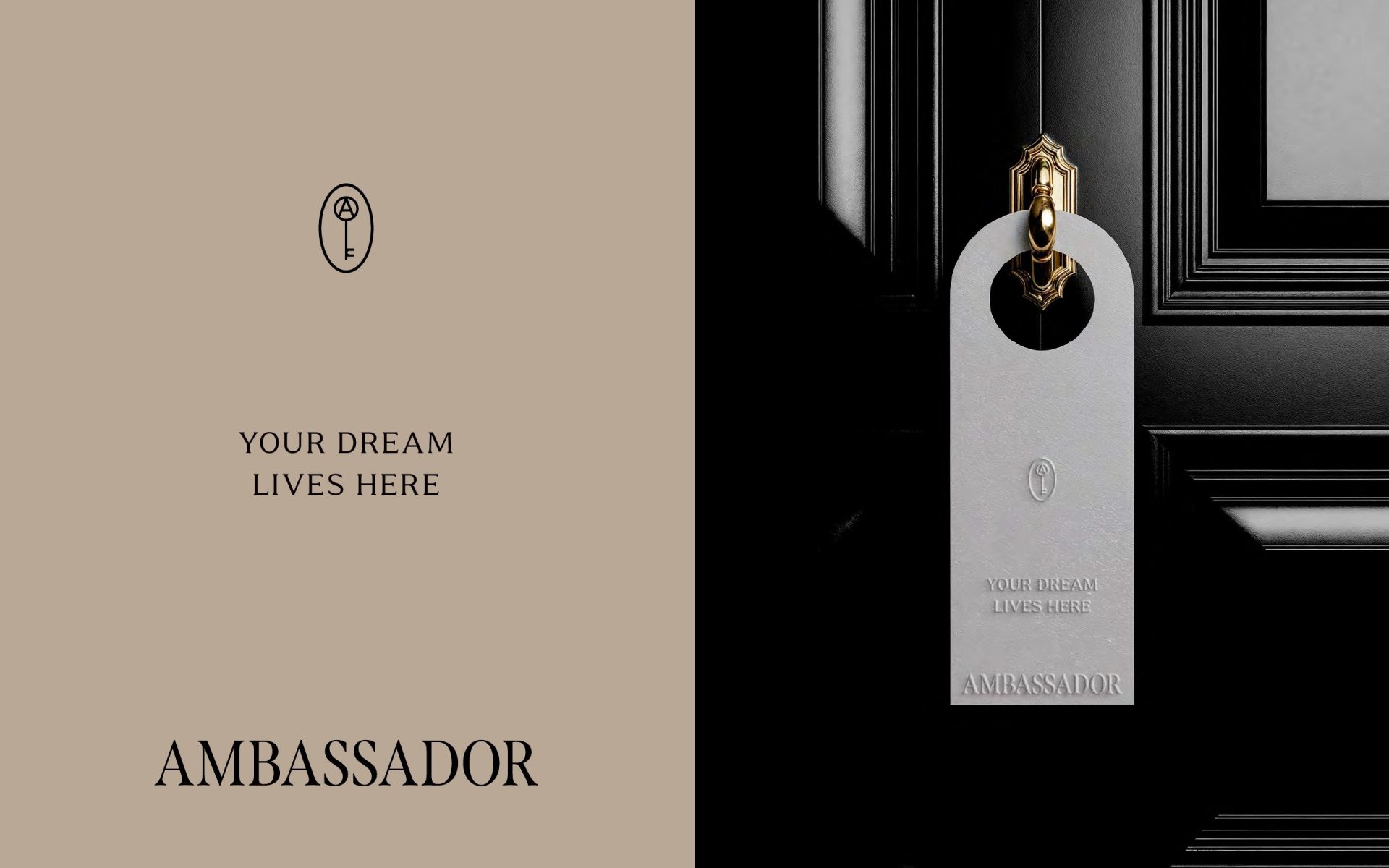
The mark is two things at once: the letter A, drawn with a custom stroke, and an old hotel key — the object every guest of the original Ambassador once held. The key’s structural lines carry security and heritage; the A gives it a distinct, artistic accent. Enclosed in a vertical oval, the symbol reads as a seal of prestige: stable, cohesive, architectural. It works embroidered on a shirt, stamped in foil on a matchbox, and cut in metal on a wall.
Logotype
Monumental, but not loud
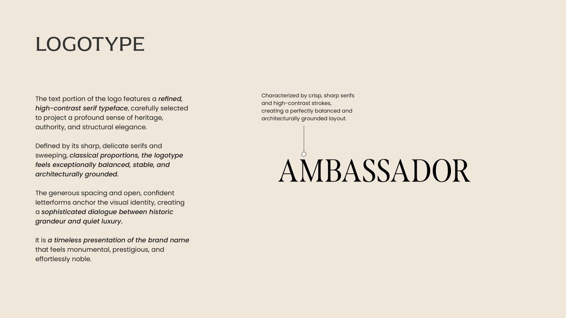
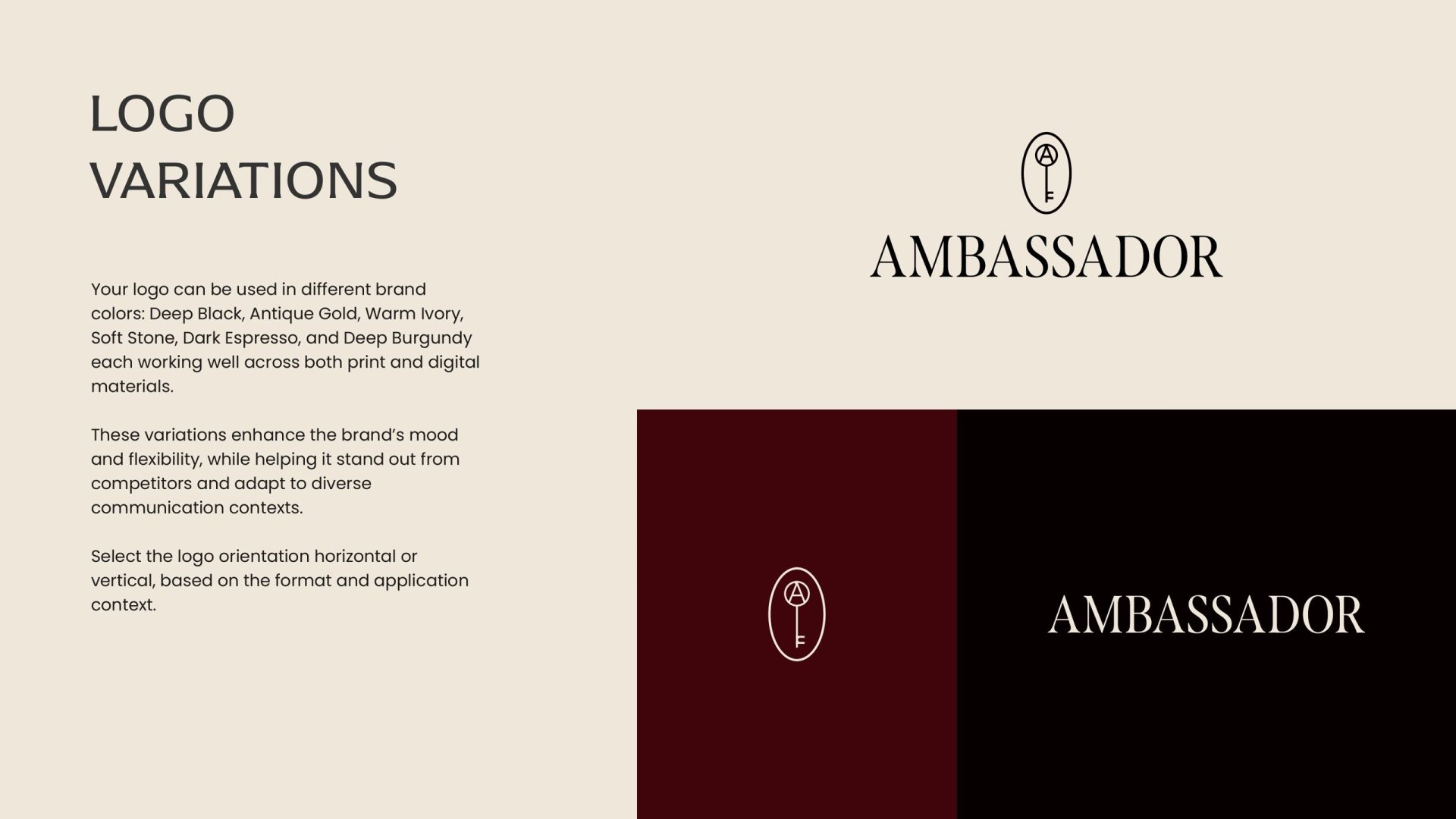
The wordmark is a high-contrast serif with wide-set capitals: crisp strokes, sharp terminals, classical proportions. The generous spacing gives it a strong horizontal presence for signage and a quiet elegance on a business card. It sits vertically under the symbol for collateral and runs horizontally for signs and the website — and it holds its character at both scales, which is what the brief asked of it.
Identity
Black, antique gold and burgundy
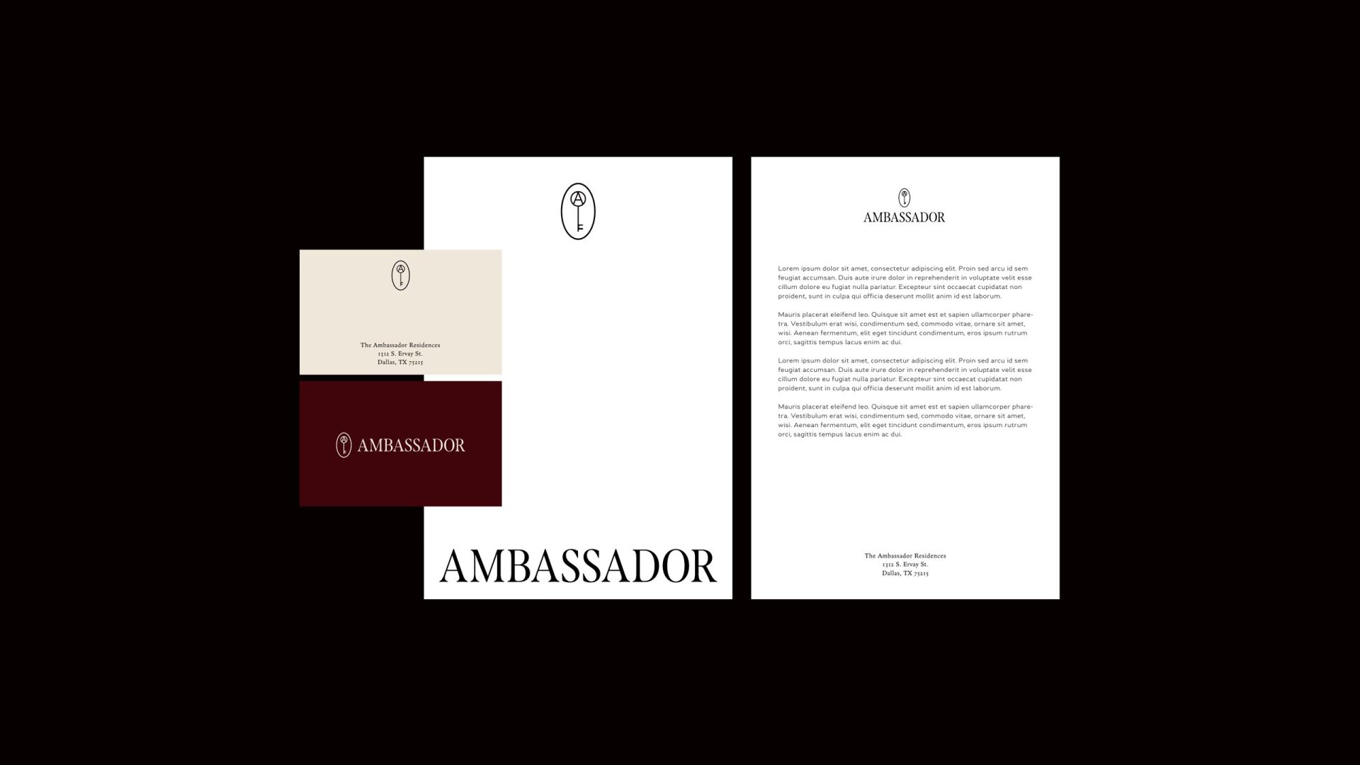
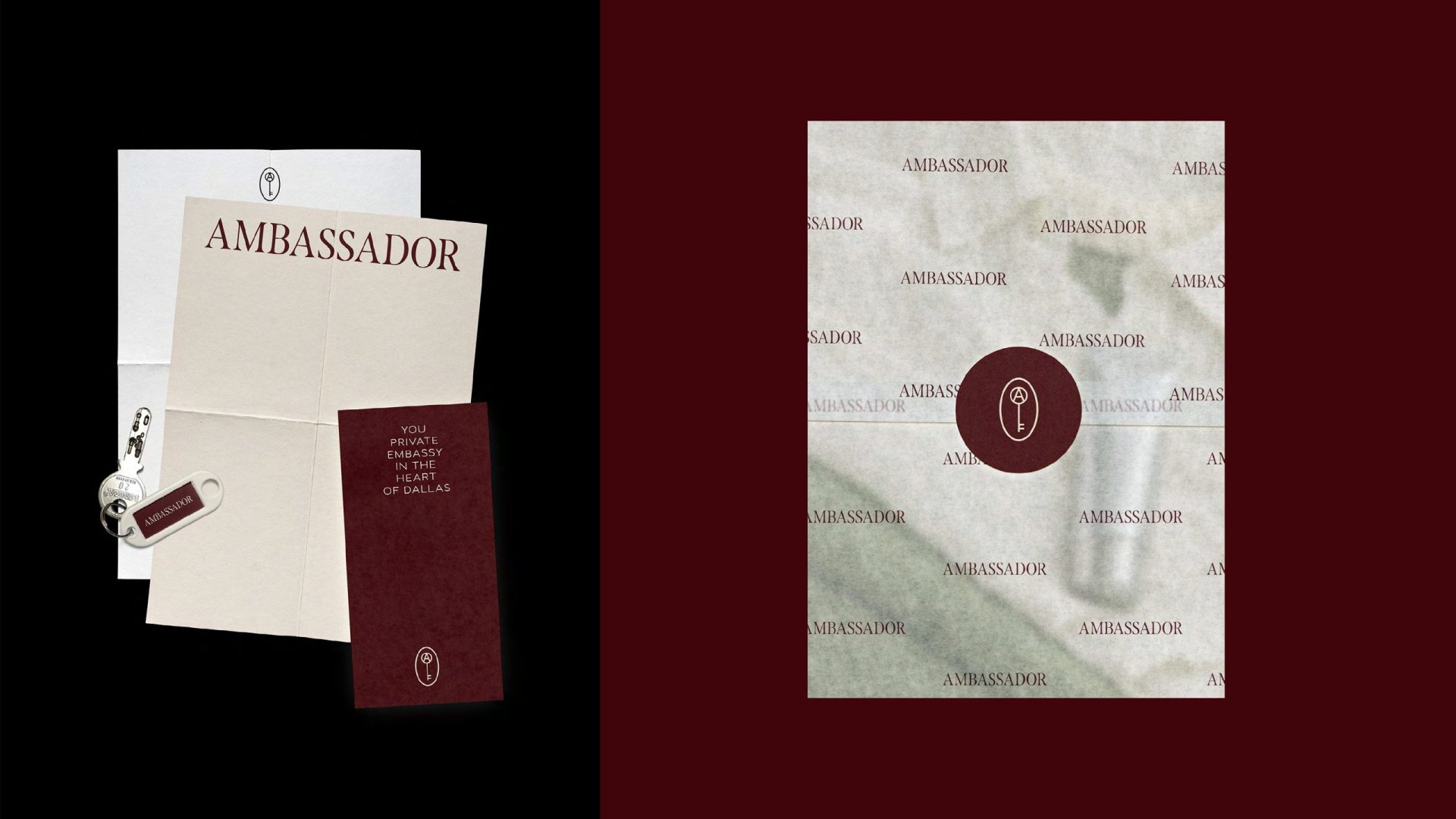
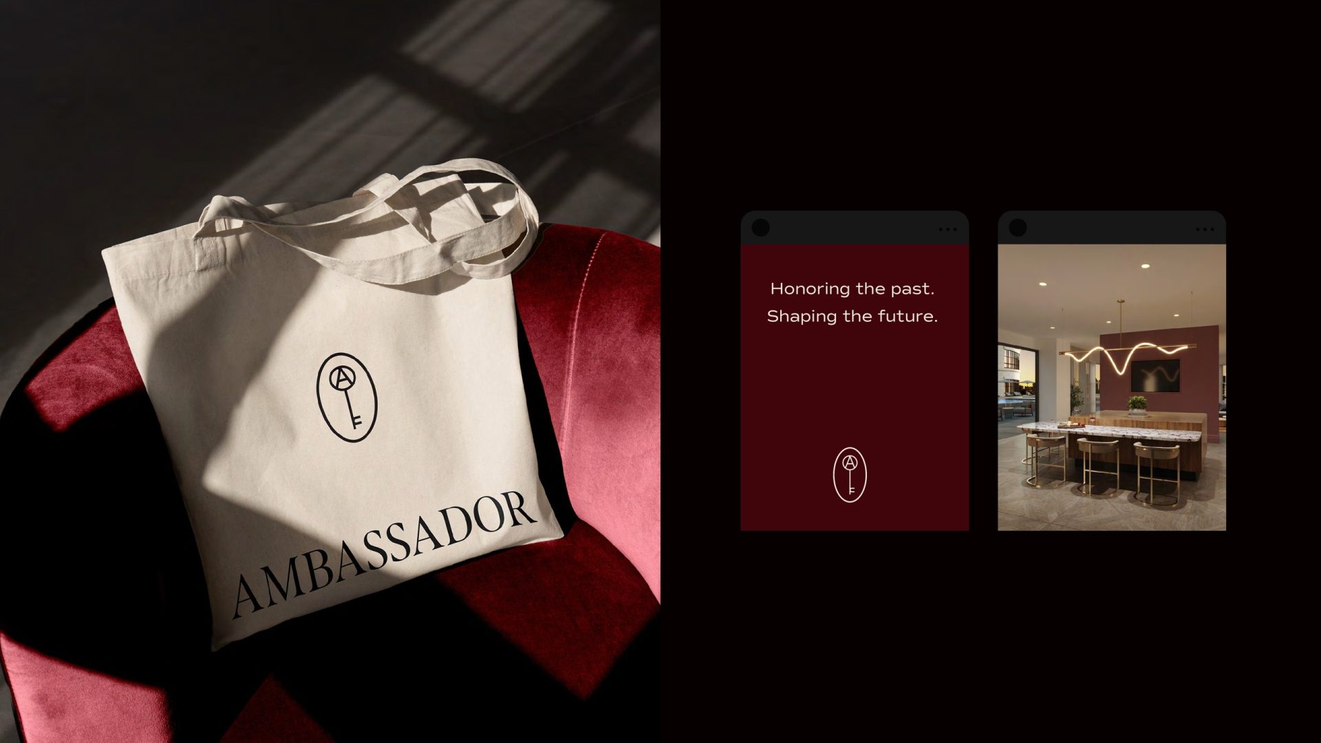
The palette follows the brief and the interiors: deep black, antique gold, warm ivory, soft stone, dark espresso, with burgundy as the accent that makes a page feel like a velvet chair. The system extends into stationery, the resident welcome folder, a neighbourhood map, business cards — and into the objects a hotel would leave in a room: a tee, a tote, a box of matches. Thin gold rules and restrained deco framing do the ornamental work, sparingly, as the brief demanded.
Launch campaign
Sneak peek
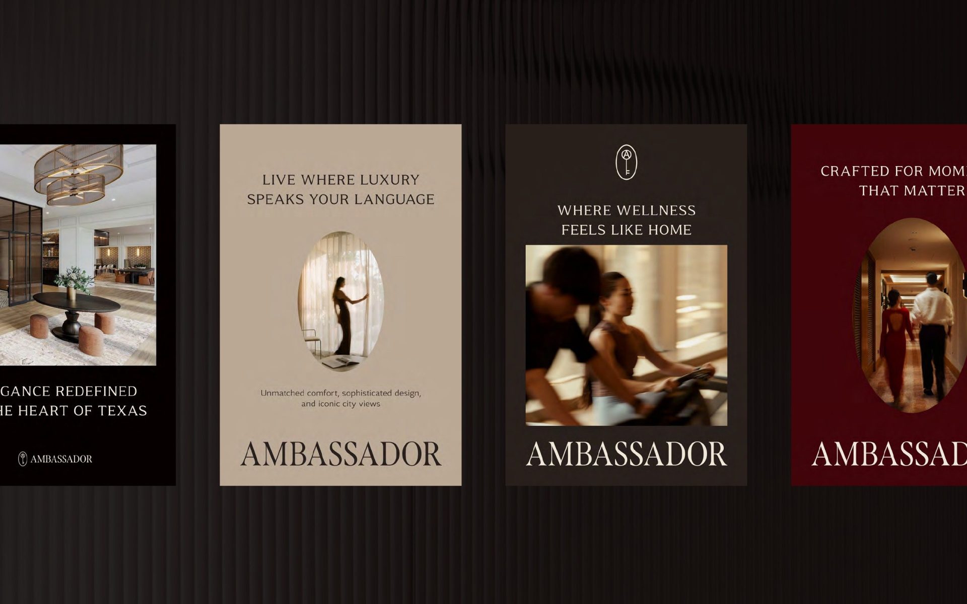
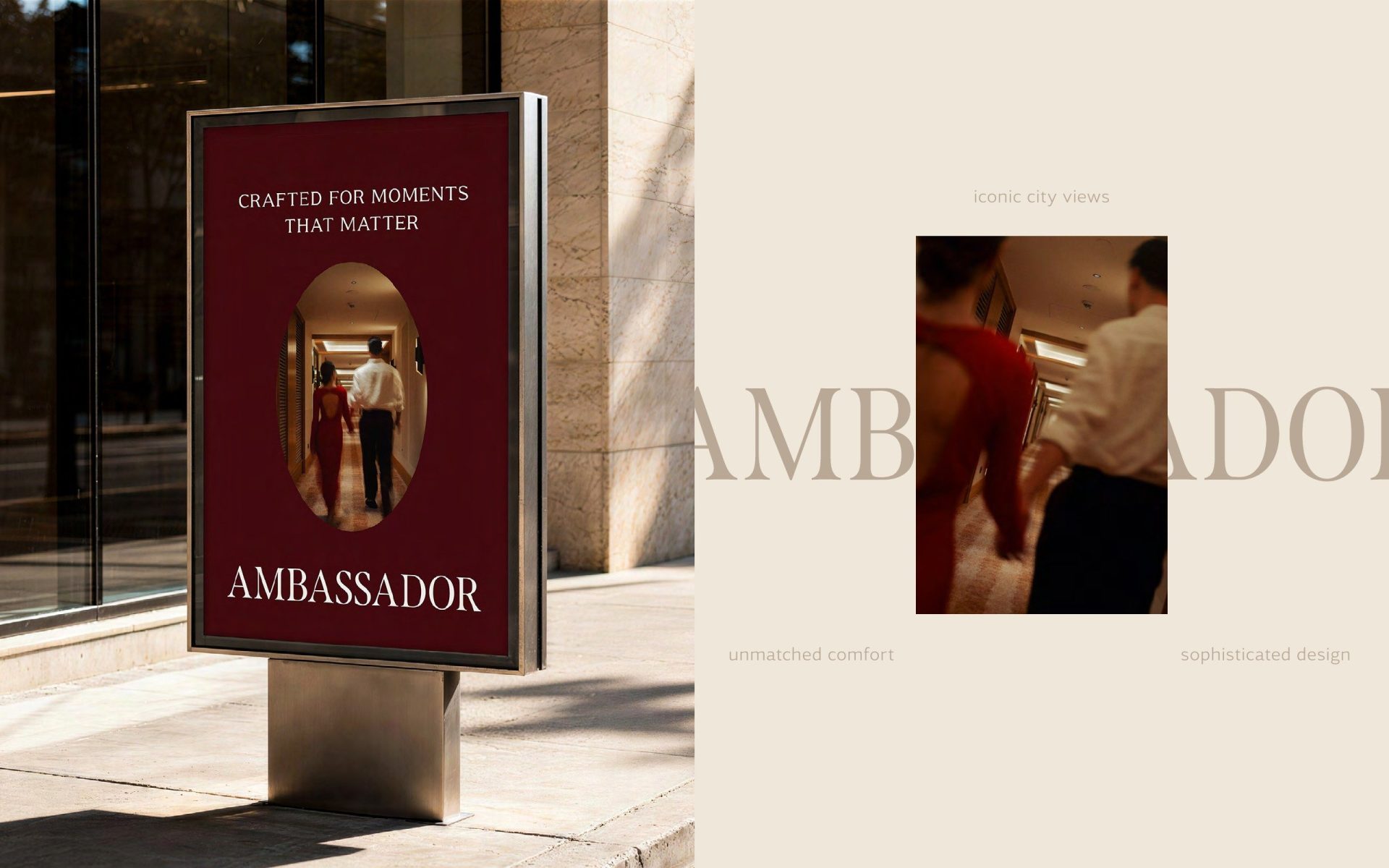
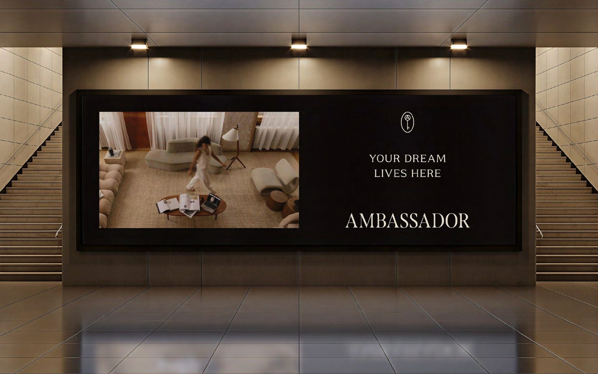
Before the building opened, the brand had to start leasing it. We designed the first campaign wave — posters and social formats, a street poster, a billboard, a door hanger — around three lines: Live where luxury speaks your language, Your dream lives here, Crafted for moments that matter. Each layout frames a moment inside the building in the brand’s arch, so the campaign looks like the interiors it sells.
3D renderings
The spaces the brand belongs to
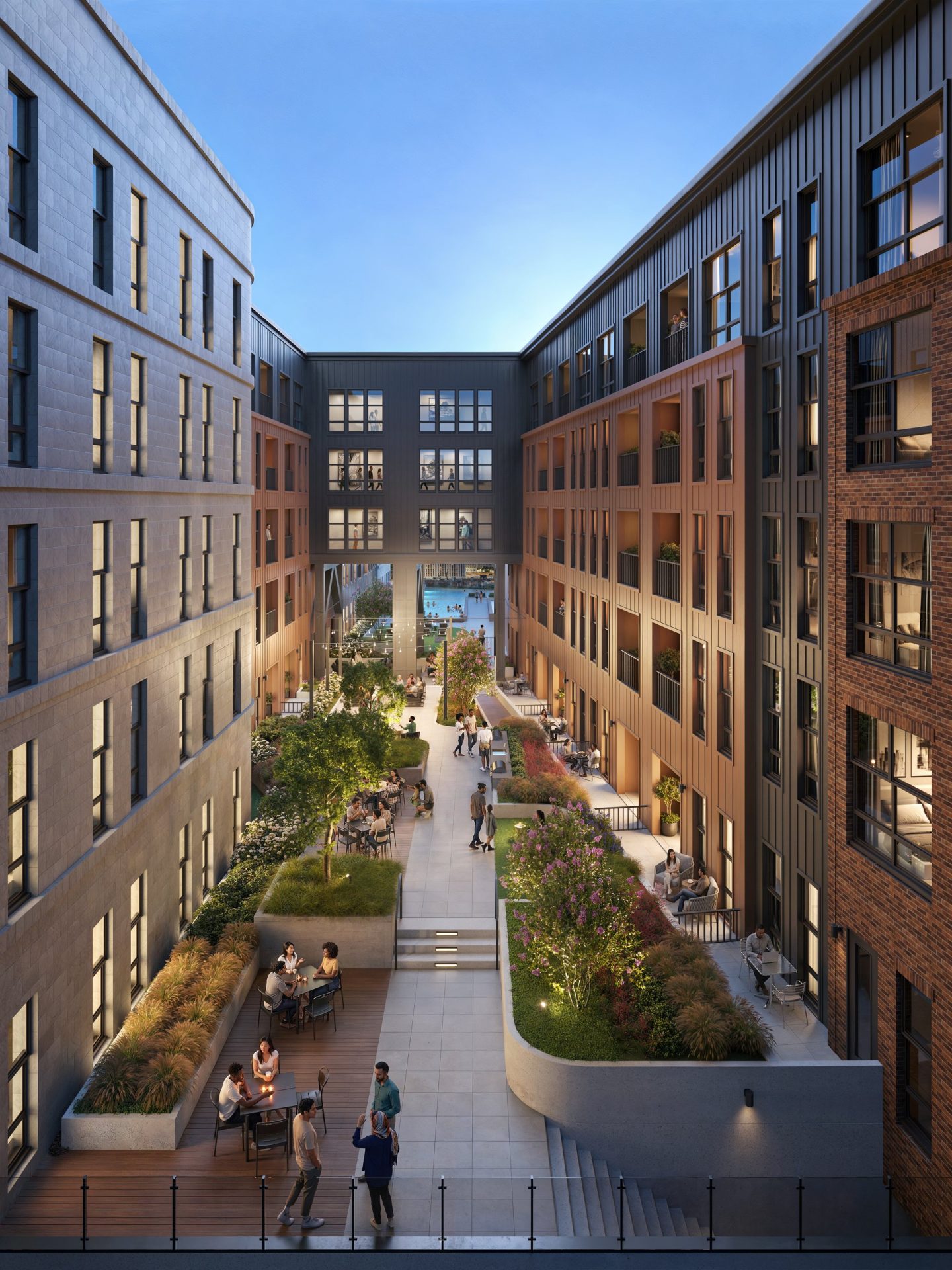
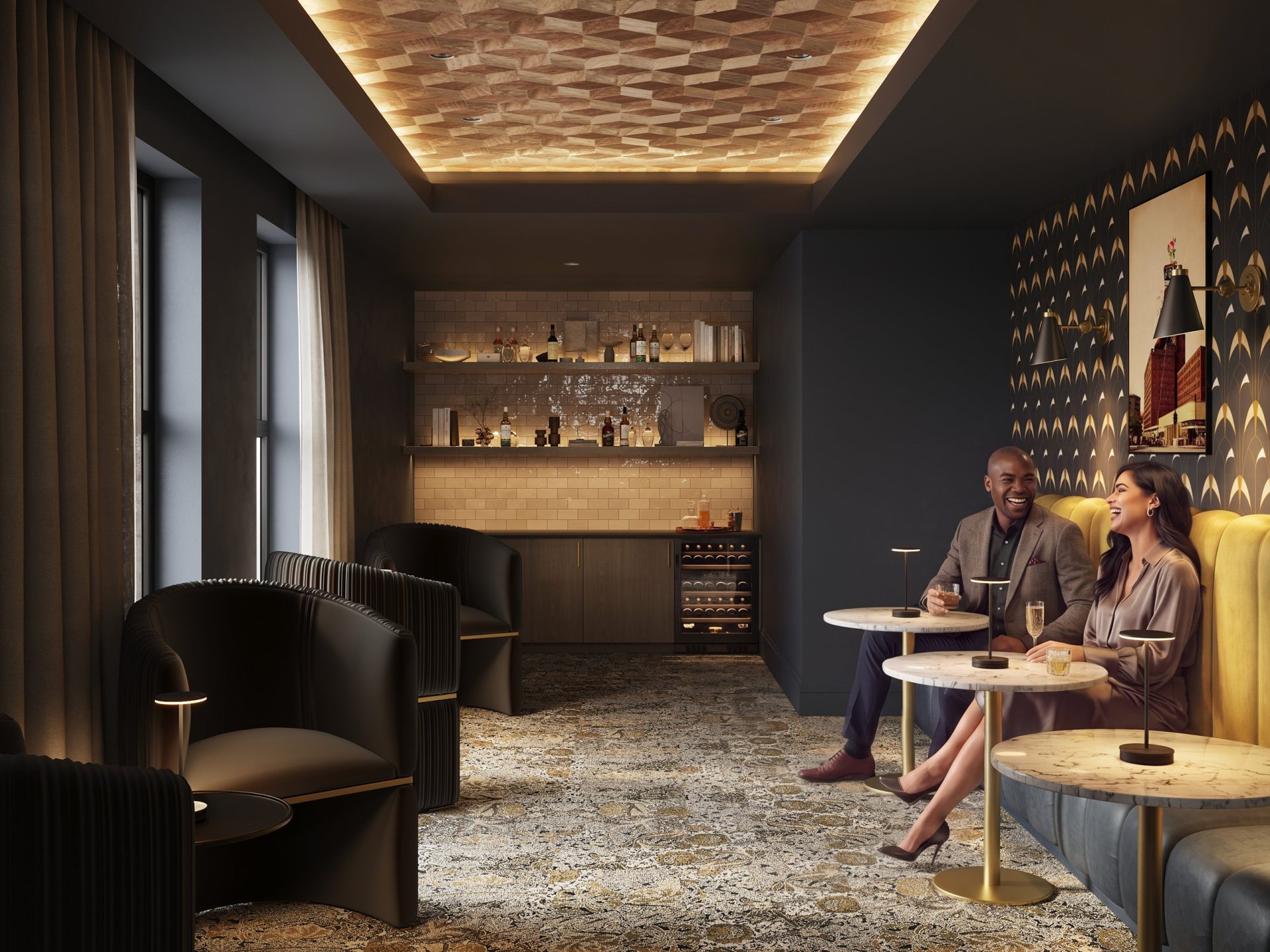
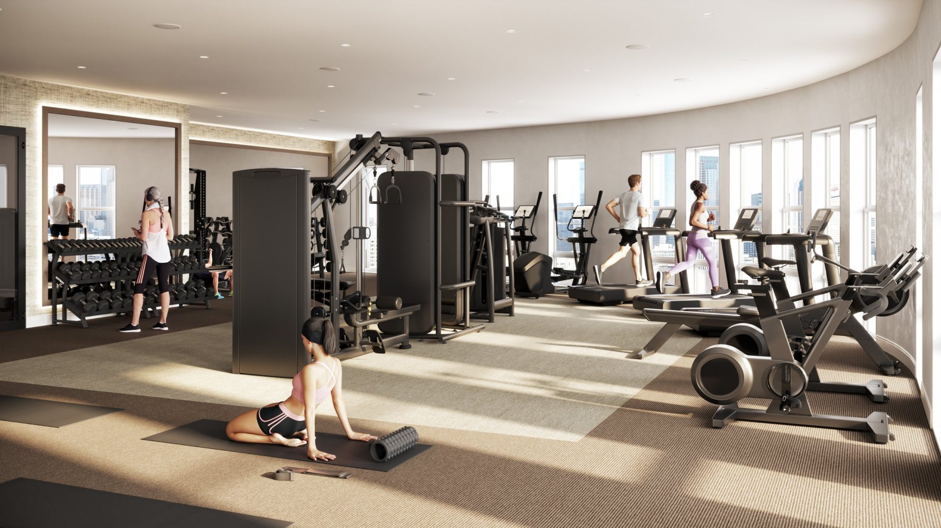
The same team that drew the mark rendered the building it will live in: the courtyard at night, the speakeasy lounge with its brass and velvet, the fitness club in morning light. Because identity and renderings came from one studio, the palette on the page and the palette in the rooms are the same — the brand does not have to be adjusted to the pictures, or the pictures to the brand.
Delivered
What ZRS Management received
Symbol, wordmark, monogram and lockups. Brand guidelines and a colour system. Stationery, business cards, welcome folder, map and merchandise — ready for print. The first campaign wave for street, out-of-home and social. Exterior and amenity renderings. Two months, one studio, and a name that finally has a brand worthy of it.
Services on this project: real estate branding — identity, collateral and campaign; 3D exterior rendering; 3D interior rendering of the amenities.