Dallas, TX
The Rowen
Overview
A premium residential community on the eastern edge of Dallas that wanted to feel elevated without shouting about it — and got a brand built around one line: modern living, naturally.
ZRS Management brought us The Rowen straight after The Ambassador, with a different brief for a different place: not a landmark hotel, but calm, well-designed homes for people who work in Dallas and want the city within reach and out of earshot. In one month we delivered the identity, a full set of brand guidelines and renderings of the residences and amenities.
- Location
- Rowlett, Dallas, TX
- Client
- ZRS Management
- Timeline
- 2026 · one month
- Scope
- Brand identity, guidelines, 3D
The brief
Premium, not flashy
The positioning was clear from the first page: comfort and calm of residential living, with the Dallas area a short drive away. Sophisticated and contemporary, but explicitly not “ultra-luxury” — premium and approachable, for professionals and couples from their late twenties to mid-forties who value design and quality. The brief asked for a strong THE ROWEN wordmark supported by a distinctive monogram, an editorial-architectural visual language, and a palette of warm neutrals, natural stone, wood, off-white, charcoal and a subtle muted green. And one prohibition we agreed with: no generic real-estate symbols — no roofs, no buildings, no obvious luxury clichés.
Concept
An R in a doorway
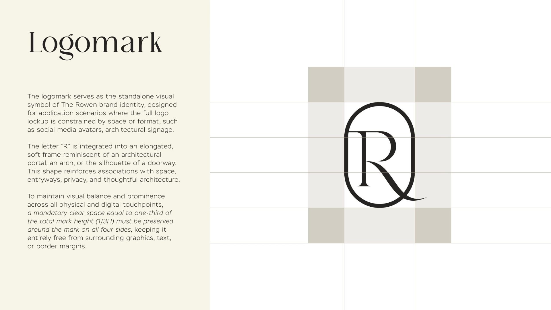
The brief offered four directions to explore: an editorial wordmark, an architectural R, a frame, an abstract mark. We brought the best of two together. The logomark is the letter R set inside an elongated, softly rounded frame — a portal, an arch, the silhouette of a doorway. Entering a new space, entering a new chapter, coming home. The R itself is a serif letter with a long, calm tail, so the mark reads as a monogram from a distance and as an entrance up close. It works on its own for signage and social avatars, and above the wordmark in the full lockup.
Wordmark
Quiet capitals
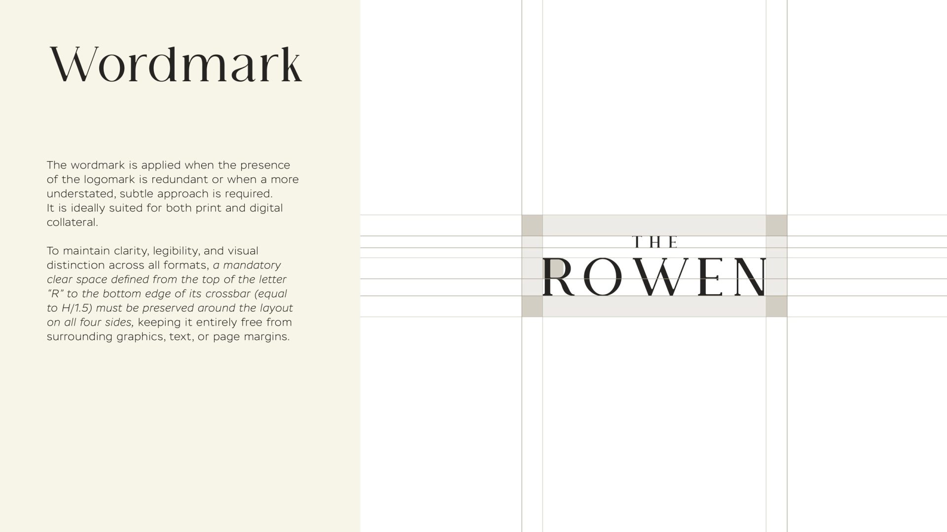
The wordmark is the name in wide-set serif capitals with a smaller THE above — the editorial direction the brief asked for, kept deliberately restrained. It appears without the logomark where the mark would be redundant or where space is tight: letterheads, wayfinding, the foot of a brochure page. On a black or muted-green field it becomes the brand’s quietest and most confident gesture.
Colour & type
Off-white, charcoal, wood, muted green
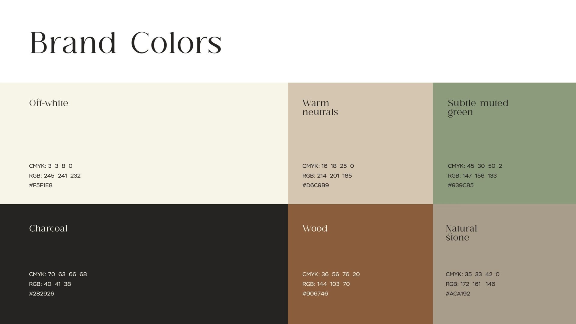
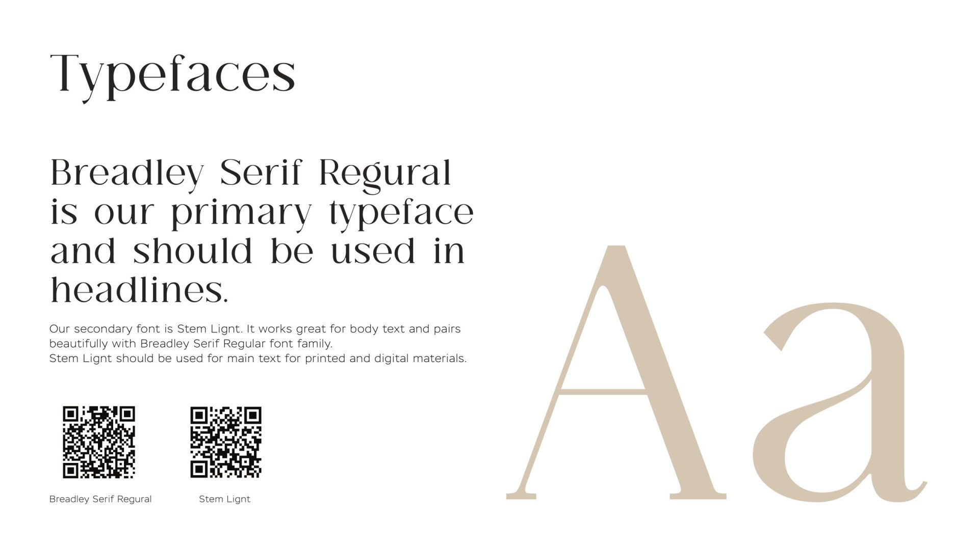
The palette is the one the interiors were already speaking: off-white and warm neutrals for space, charcoal for structure, wood and natural stone for warmth, and a subtle muted green as the accent that keeps it from feeling corporate. Typography pairs Bradley Serif for headlines — elegant, contemporary, a little editorial — with Stem, a clean sans-serif, for everything that has to be read quickly. The guidelines fix the pairings, the hierarchy and the clear space so the brand stays consistent long after the launch.
Applications
A pattern, a folder, a sign
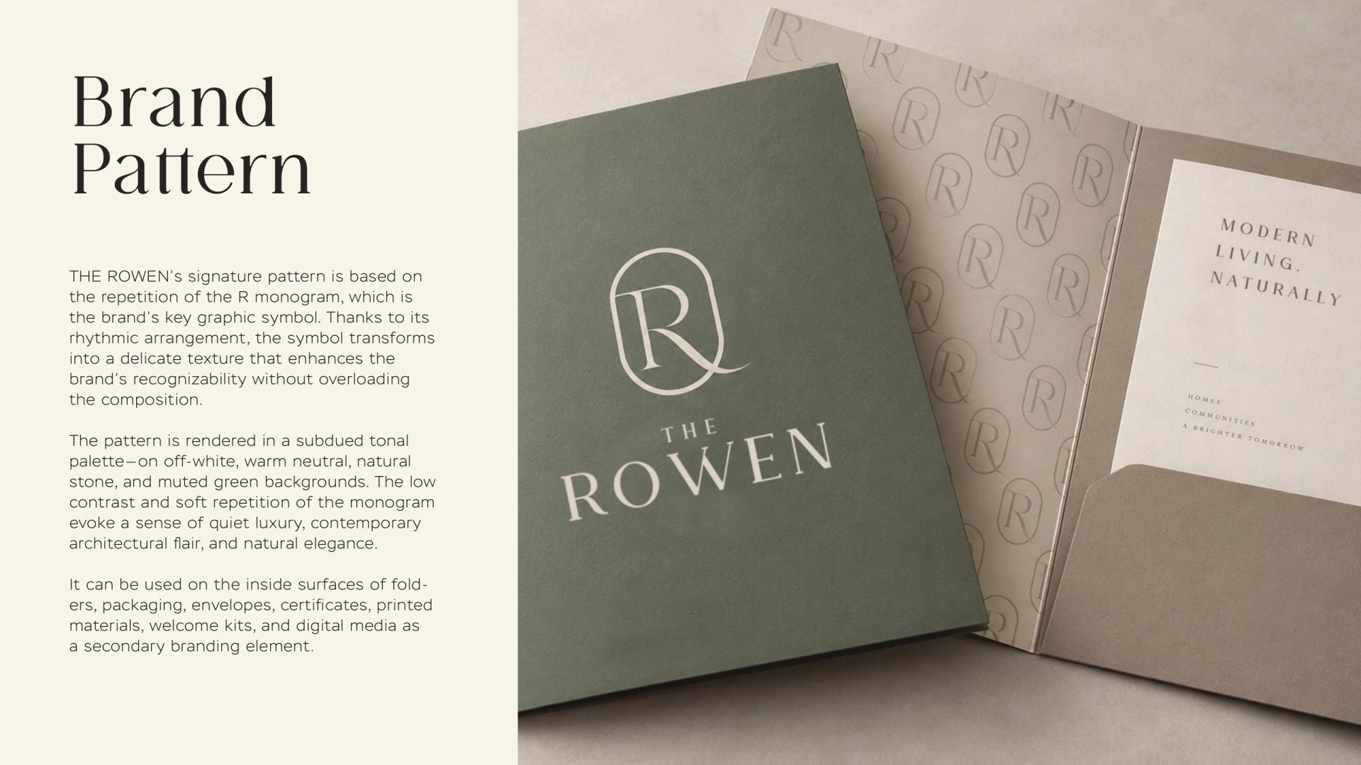
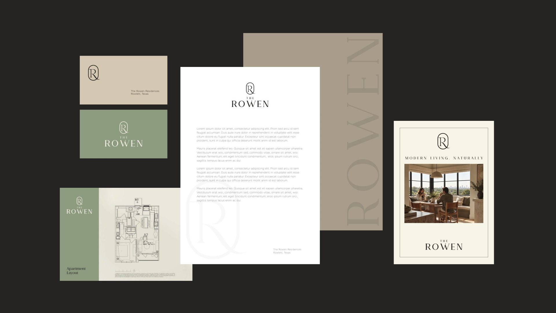
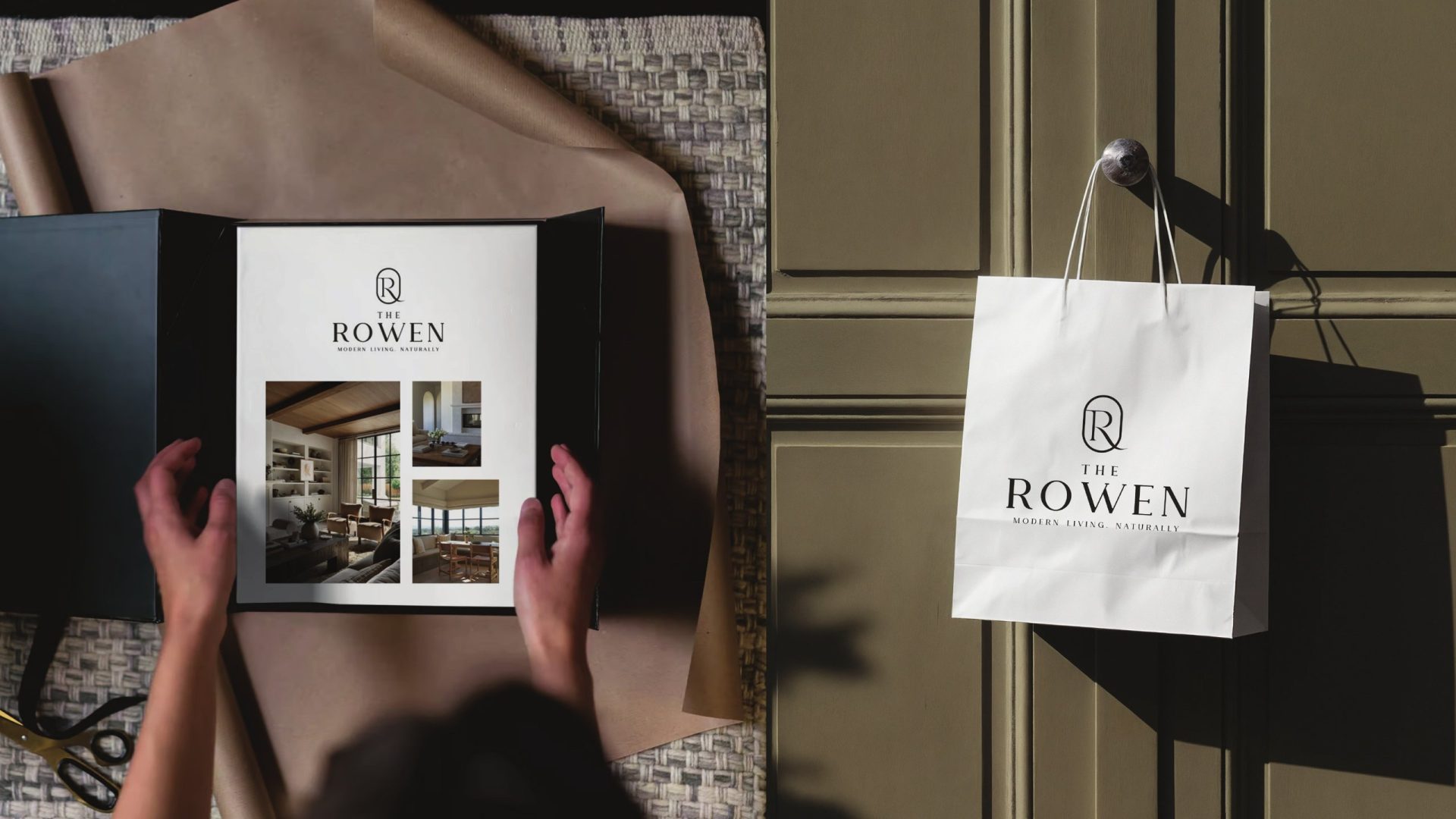
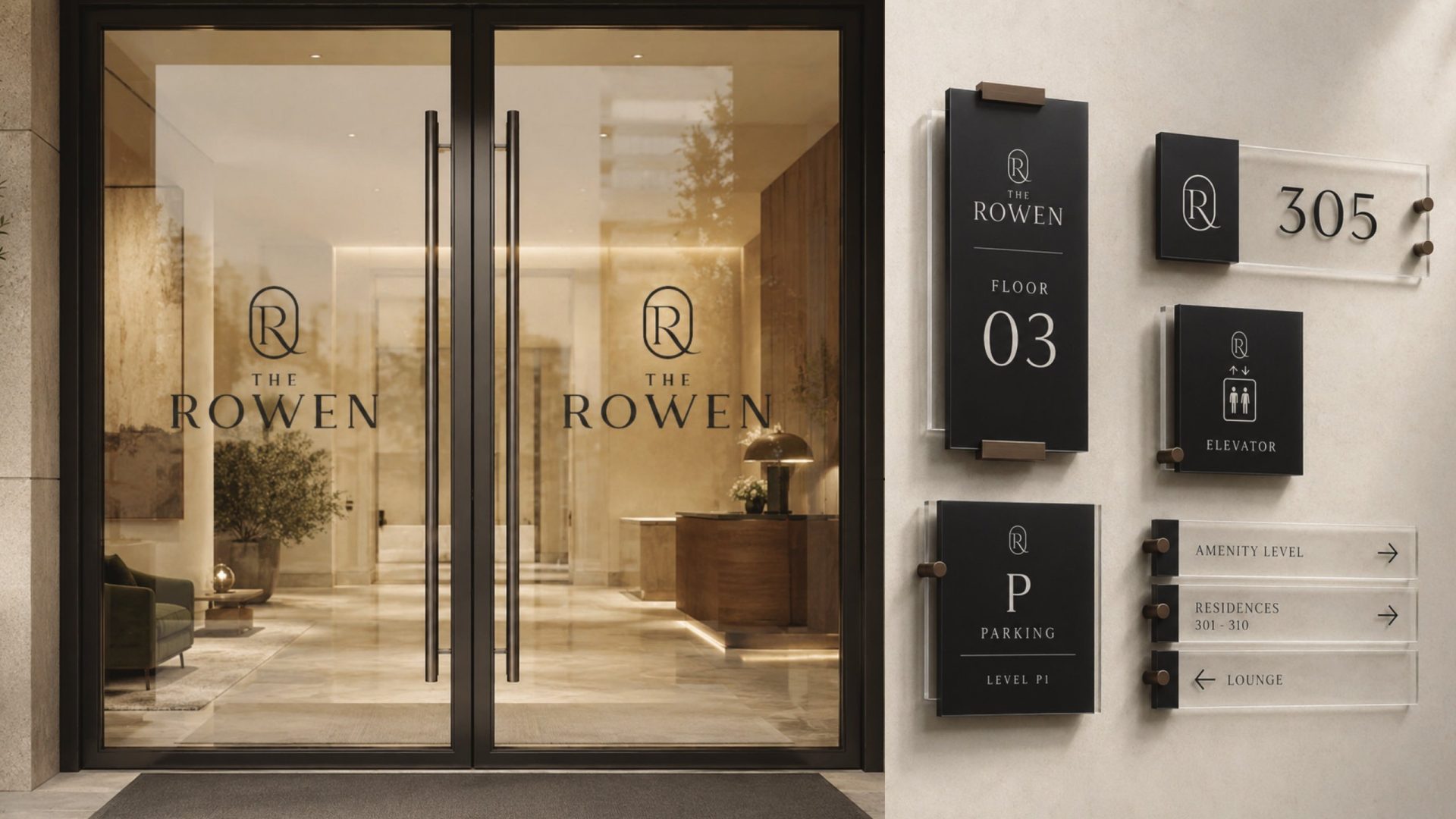
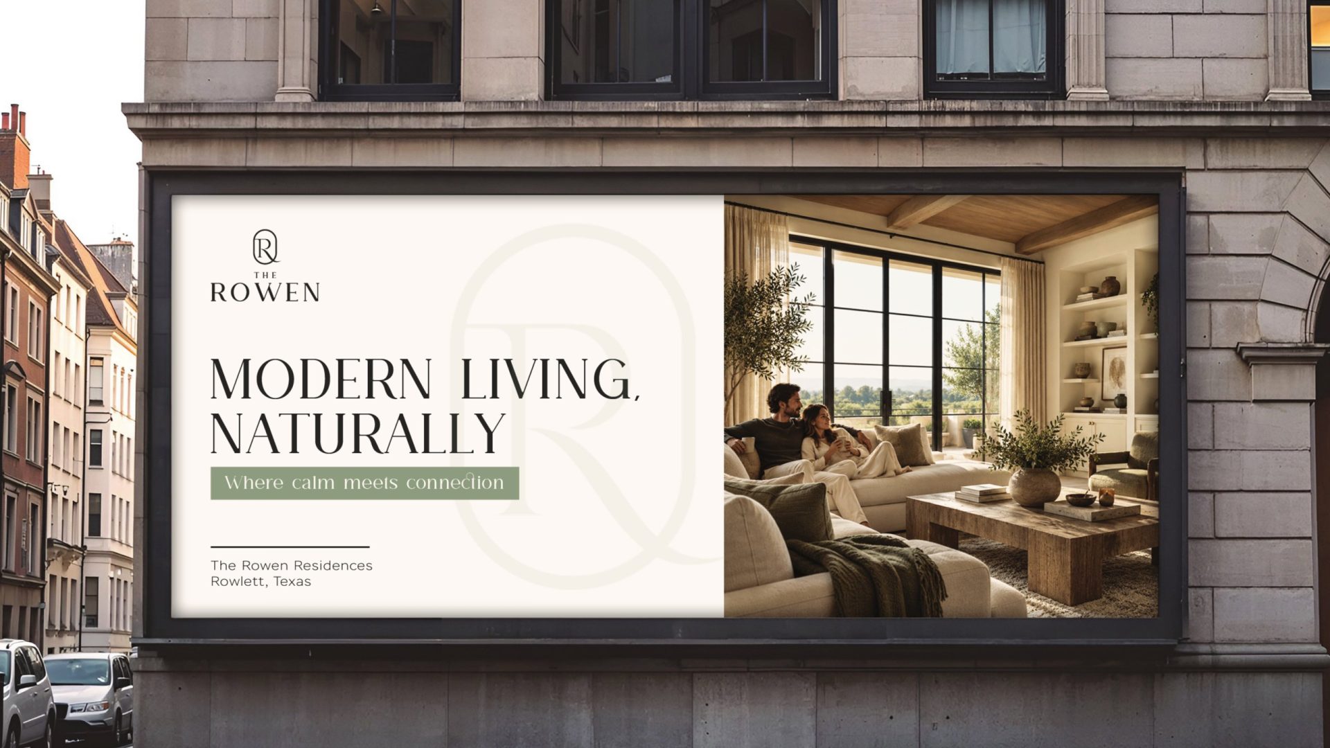
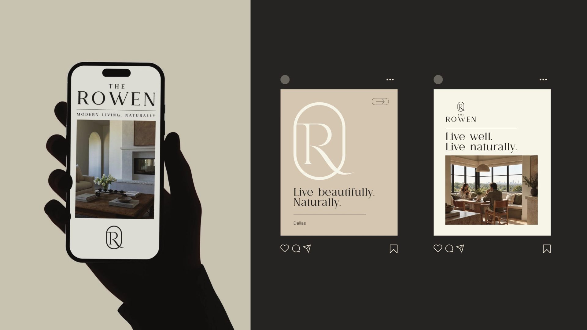
The R repeats into a signature pattern — subtle, rhythmic, used inside folders and on the reverse of cards rather than on the front of anything. From there the system goes onto the things residents and prospects actually touch: the leasing folder and brochure, business cards, a bag, building signage and wayfinding, a billboard, the social feed. Every surface carries the same three colours and the same two typefaces, so the community is recognisable before the name is read.
3D renderings
The homes the brand promises
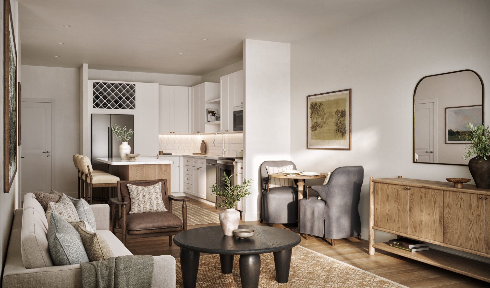
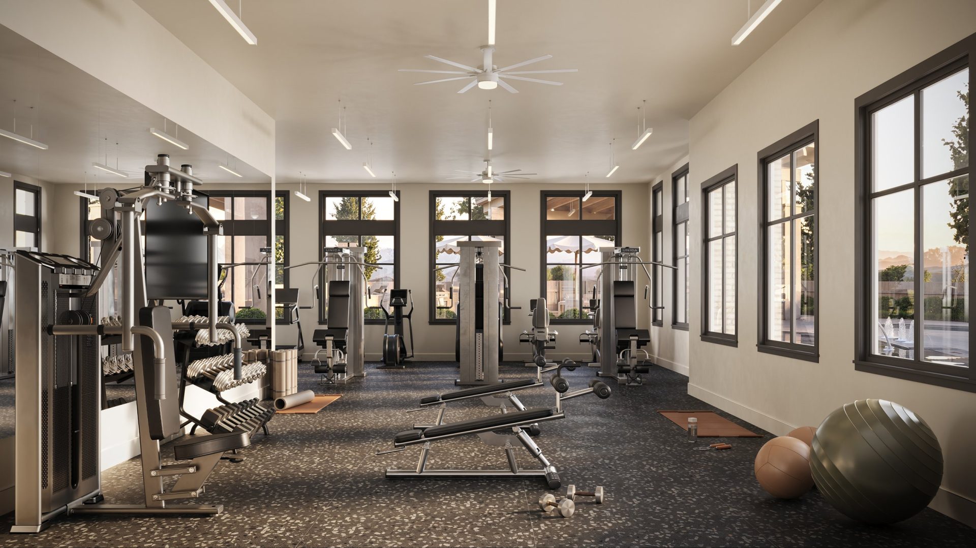
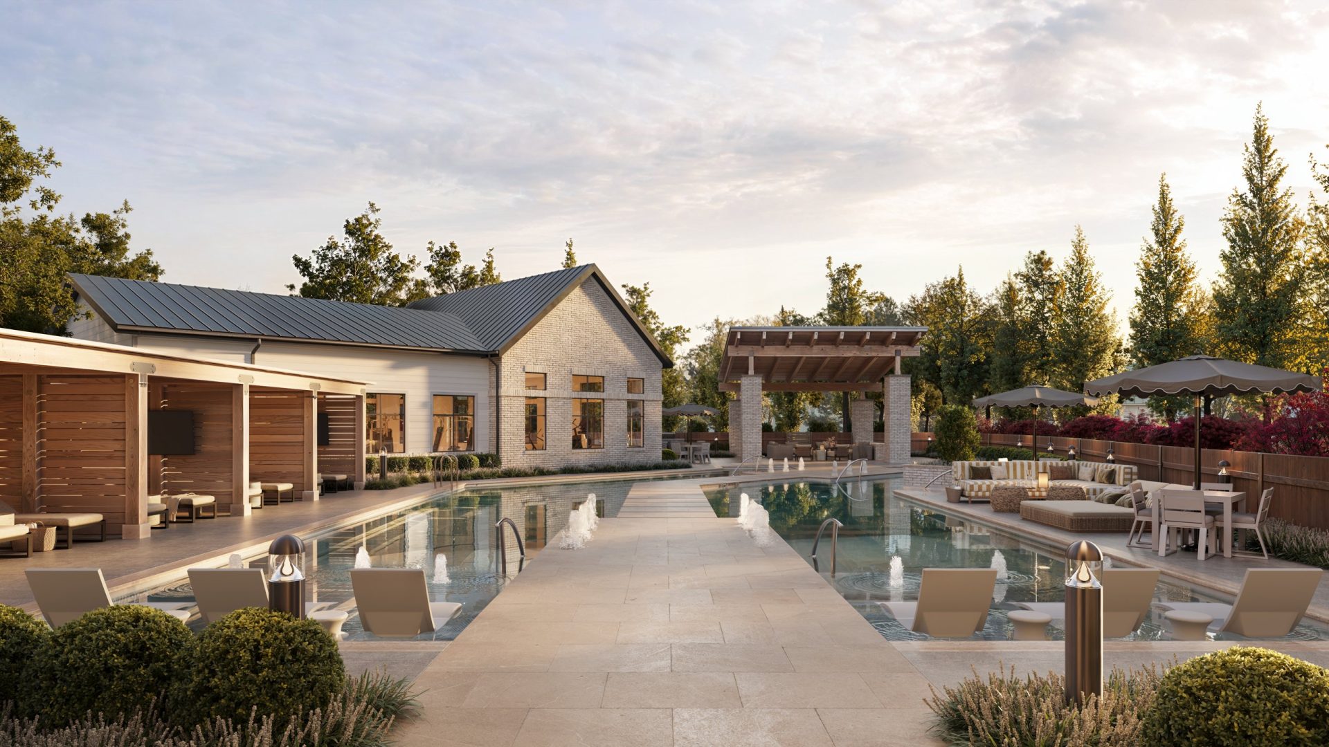
Alongside the identity we rendered the residences and amenities: a kitchen and living room in morning light, the fitness club, the pool at sunset. The renderings follow the interior design files the brand was built from, so the palette on the page and the palette in the rooms are one and the same — which is also why the campaign imagery in the guidelines looks like it belongs to the same place. It does.
Delivered
What ZRS Management received
Logomark, wordmark and lockups. Brand guidelines: colour, typography, pattern, clear space, imagery, print, signage, digital and social. Stationery, folder, brochure and bag layouts, outdoor and social templates. Interior and amenity renderings. One month, one studio — and a community whose brand feels like its interiors, not like a sales office.