Kissimmee, FL
Citrus Vista
Overview
An apartment community near Orlando that had been leasing under one name for years — and needed a new one, with a brand to match, to start again.
ZRS Management, one of the largest apartment operators in the Southeast, was repositioning a community in Kissimmee. The brief was two lines long: a modern, sleek, impactful look, and bright colours. Everything else — the name, the story, the identity and what it would live on — was ours to propose.
- Location
- Kissimmee, FL
- Client
- ZRS Management
- Year
- 2026
- Scope
- Naming, brand identity, print
The brief
Two lines and a colour hint
The community existed, the address existed, the residents existed. What did not exist was a reason to look at it twice. ZRS Management wanted a rebrand that would read as new to the Orlando rental market without pretending the place was something it was not: a low-rise community among palms, an hour from the coast, in the middle of Florida’s citrus country. Modern, sleek, impactful — and, the brief suggested, something bright, perhaps green and orange.
Naming
Citrus Vista
We started from the ground the community stands on. Kissimmee sits in the old citrus belt of Central Florida: orange groves were the landscape here before the theme parks were. Citrus brings that back — the colour, the light, the fruit on the tree — and reads as Florida to anyone in the country. Vista is the view and the outlook: what you see from the terrace, and what you expect from the move. Together they make a name that is easy to say, easy to remember, works in English and in Spanish — half of Osceola County speaks it at home — and was free to take.
Mood board
Quiet luxury in bright colours
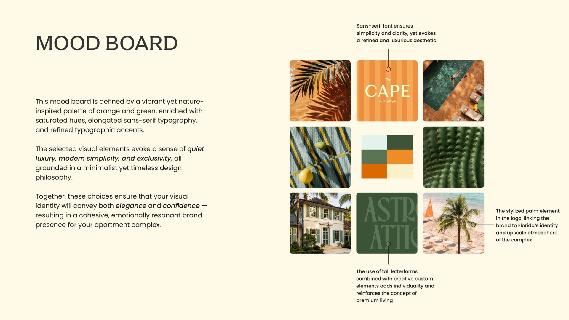
Before drawing a mark we set the mood: a nature-led palette of orange and green, saturated but not loud; tall, elongated sans-serif letterforms; a stylised palm as the recurring motif. The board balances the two halves of the brief — impactful colour, restrained typography — so the brand could feel premium without feeling formal.
Symbol
A palm, a citrus slice and a roof
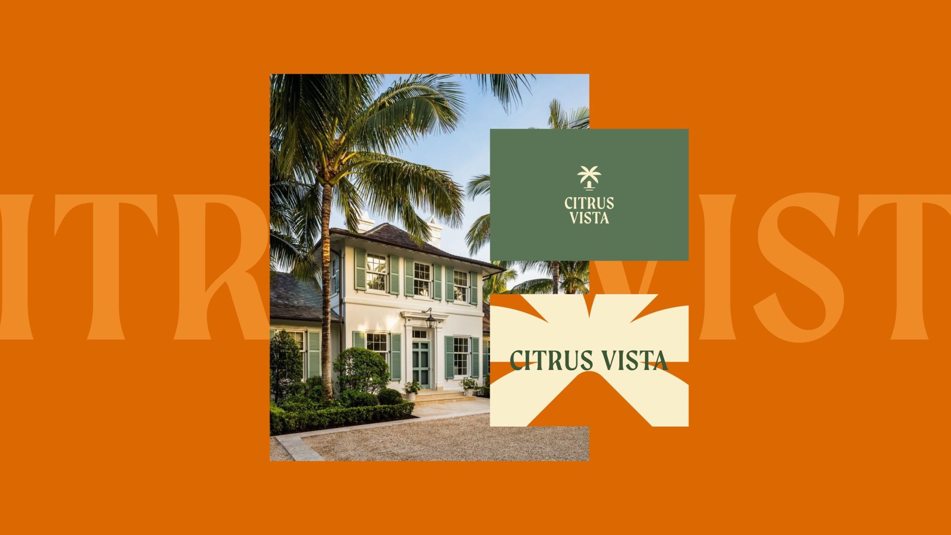
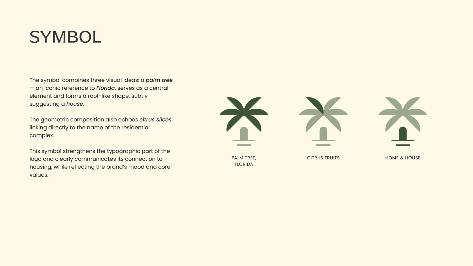
The symbol folds three ideas into one geometric shape. The palm tree is Florida’s shorthand. Its fronds form a roof over a small arched doorway, so the mark reads as a house. And the fan of fronds echoes a citrus slice — which ties the symbol back to the name. One drawing, three readings, and all of them about living here.
Logo
Custom curves on a clean sans-serif
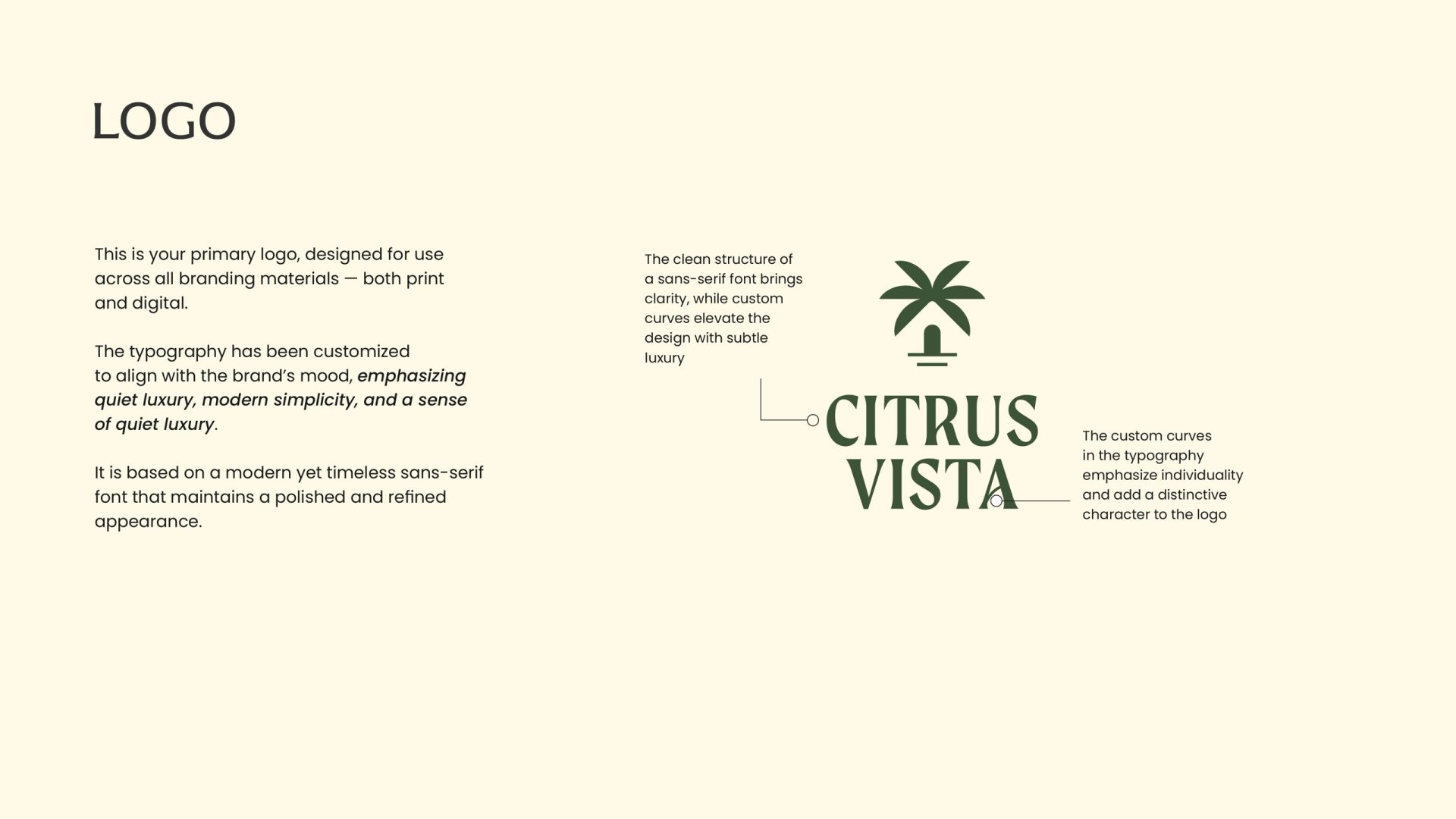
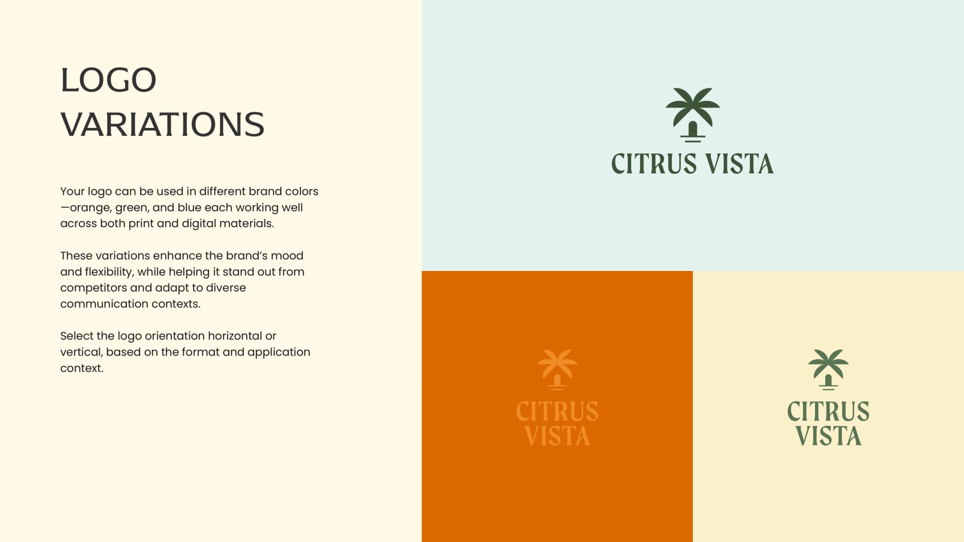
The wordmark is built on a modern sans-serif for clarity, then customised: the curved terminals on the R, S and A add character and a touch of quiet luxury without giving up legibility. It stacks vertically under the symbol for signage and packaging, and runs horizontally for letterheads and the web. Three colourways — orange, green and light blue — let the same logo change mood from a sunlit poster to a formal letter.
Identity
A system, not a logo
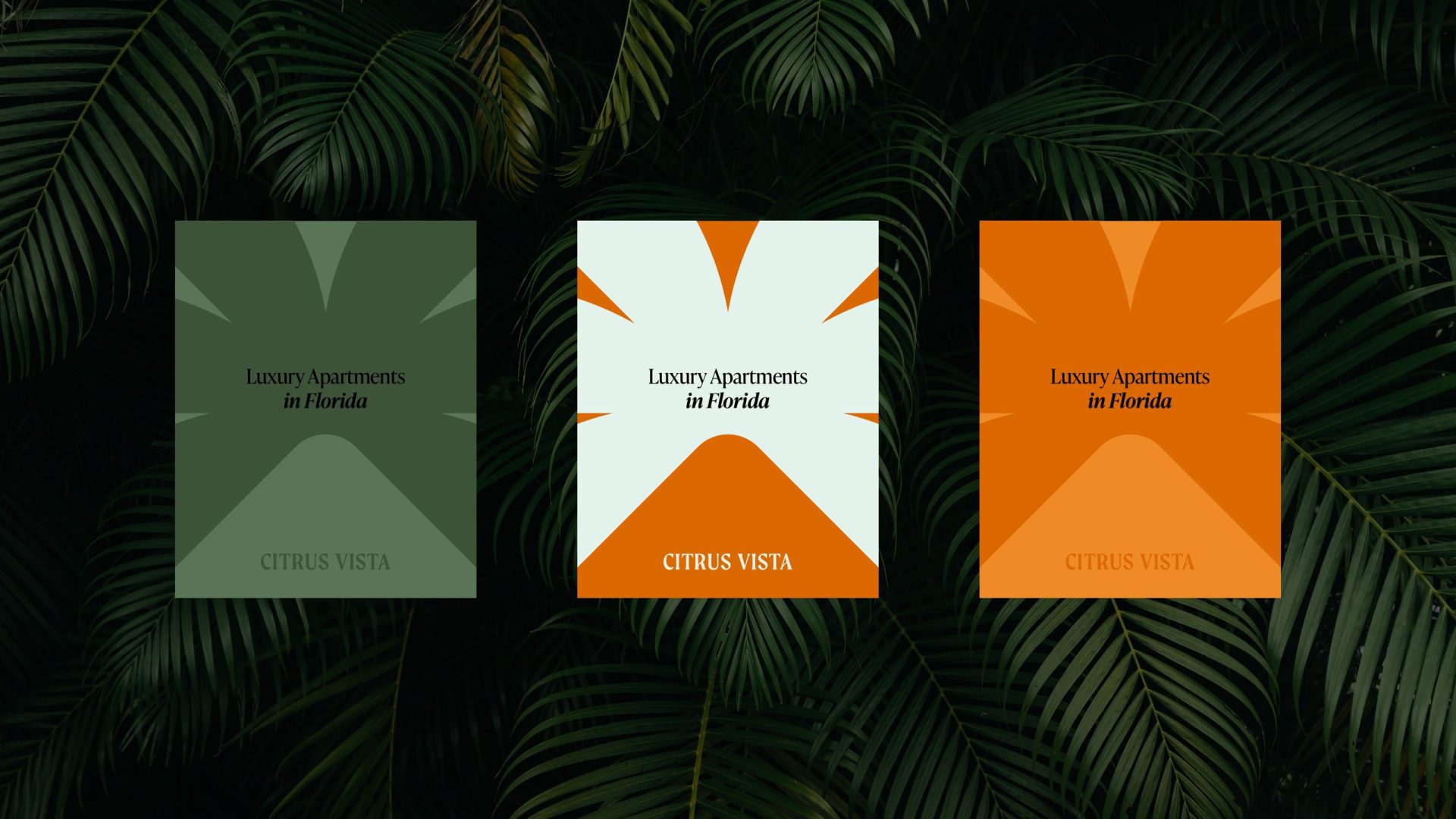
From the palette and the mark we built the graphic language: the citrus-slice geometry becomes a pattern for posters and cards, the tall capitals become oversized typographic textures, and the four colours — orange, deep green, sage and cream — give every touchpoint a place to sit. The result works as loudly or as quietly as a given surface needs.
Applications
On the things residents touch
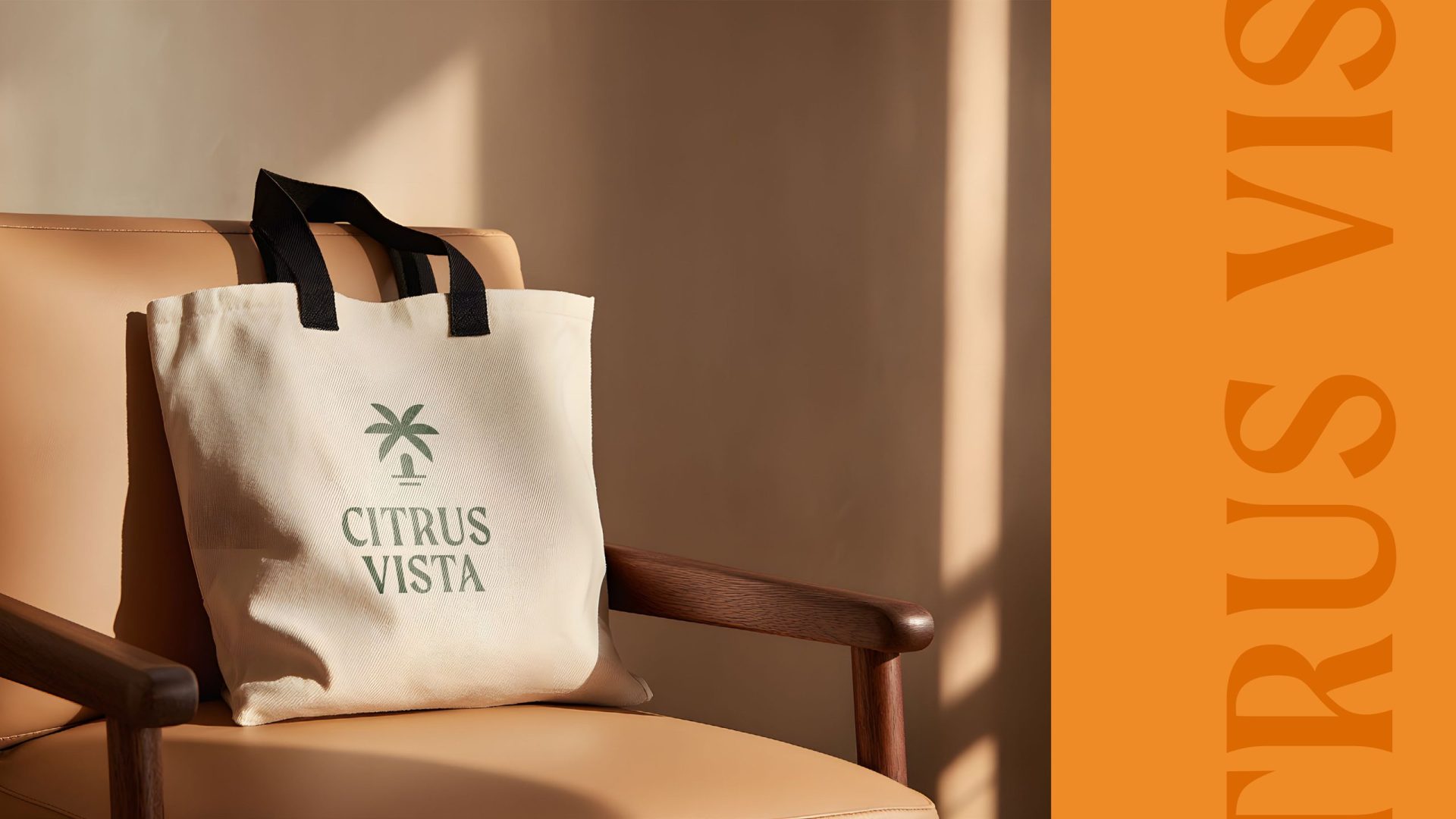
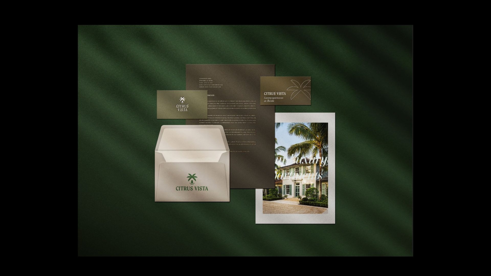
A brand for a rental community lives on small things: the tote bag at move-in, the business card of the leasing manager, the envelope the welcome letter arrives in, the poster in the leasing office. We designed the set so that the identity is recognisable from a single colour and the palm alone — before anyone reads the name.
Delivered
What ZRS Management received
A new name and the story behind it. Symbol, wordmark and three colourways. The palette, the typographic system and the graphic pattern. Stationery, business cards, posters and merchandise — designed and ready for print. A community that had a name nobody noticed now has one that says exactly where it is.